
From Woodblock to Inkjet
October 14 – November 1, 2024
From Woodblock to Ink Jet premise displays works done in the “foundational” printing processes (broadly speaking; relief, intaglio, and planar) along with works that build or extemporize on those techniques. The exhibition offers a cursory chronology of printmaking and the creative technical, conceptual, and aesthetic variations of this oldest and, arguably, most demanding and elastic of media.
The reception will be in the Fawick Gallery Lobby from 5–8PM on October 16, 2024.
EXHIBITION DATES
October 14, 2024 – November 1, 2024
Reception: Wednesday, October 16, 5 pm–8 pm
Location: Kleist Center for Art & Drama
Department of art
Develop your artistic talent and build analytical thinking and technical skills that prepare you for career opportunities in education, advertising, arts management, design and more.
Patricia Brett
Studio support for this project was provided by the Morgan Art of Papermaking Conservatory and Educational Foundation.
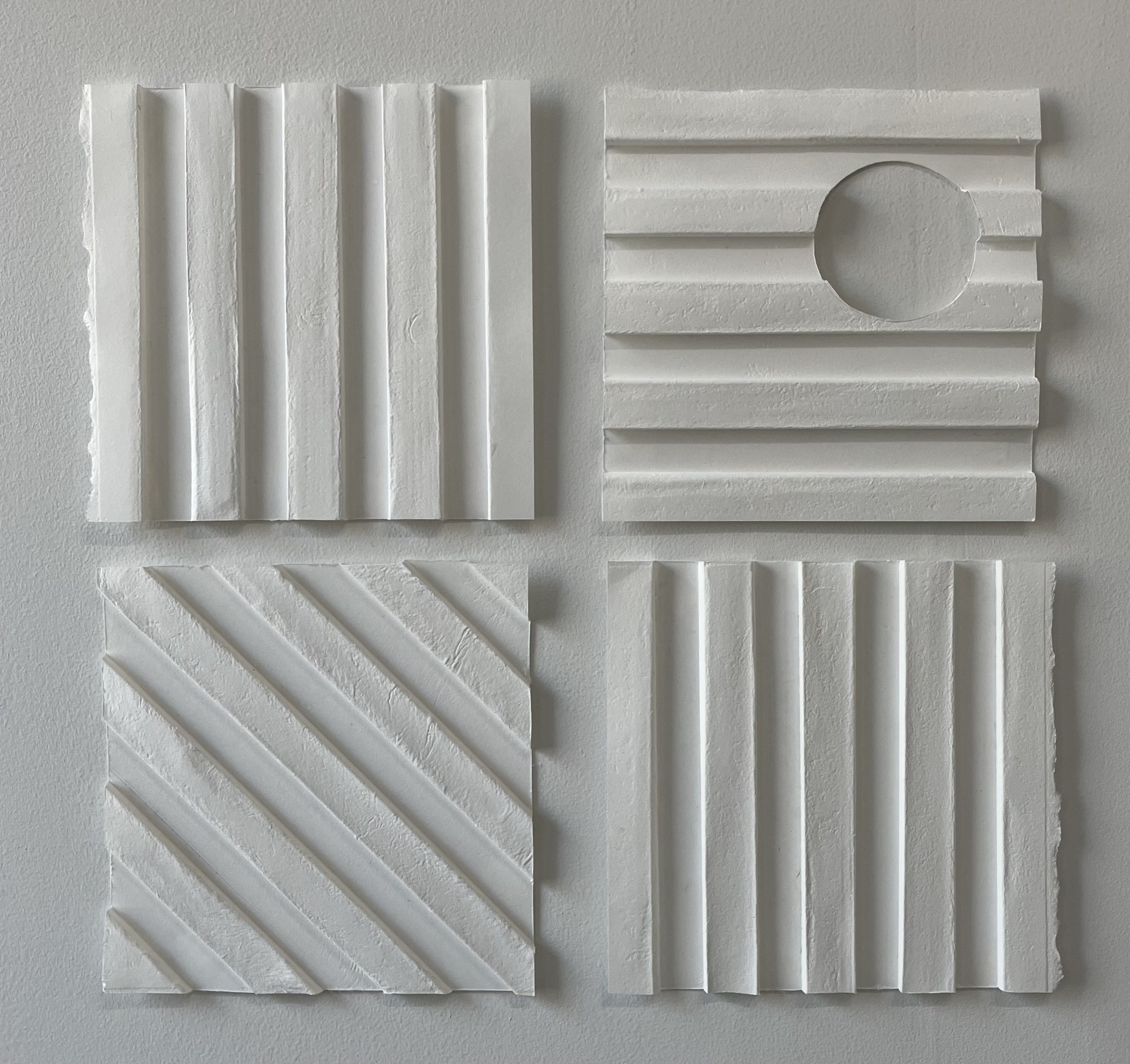
Four Square: Homage to D. Buren and S. LeWitt
2023, Cast Paper Relief, 17″ x 17″
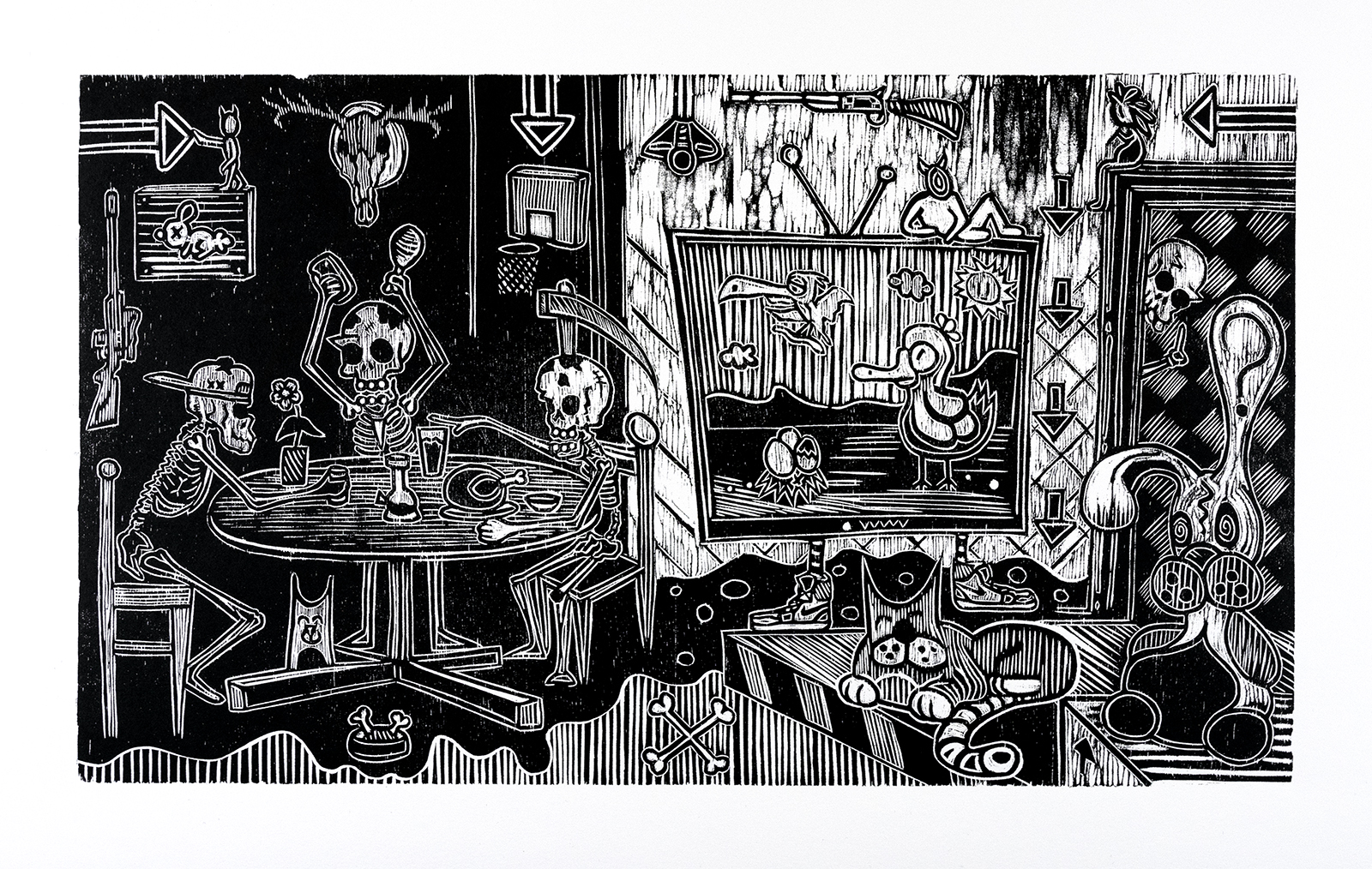
Dining Room
Woodcut on Paper
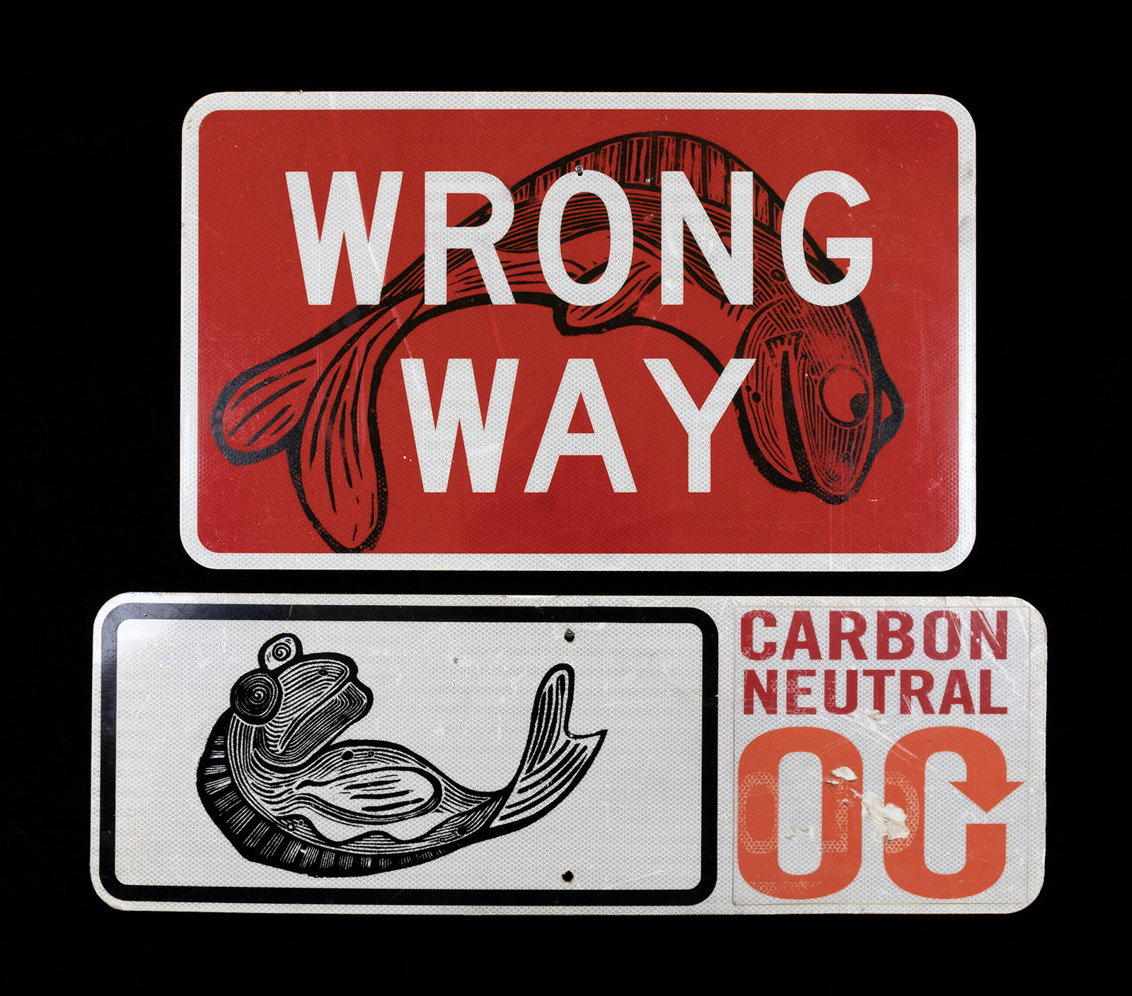
Wrong Way
Woodcut on Street Sign
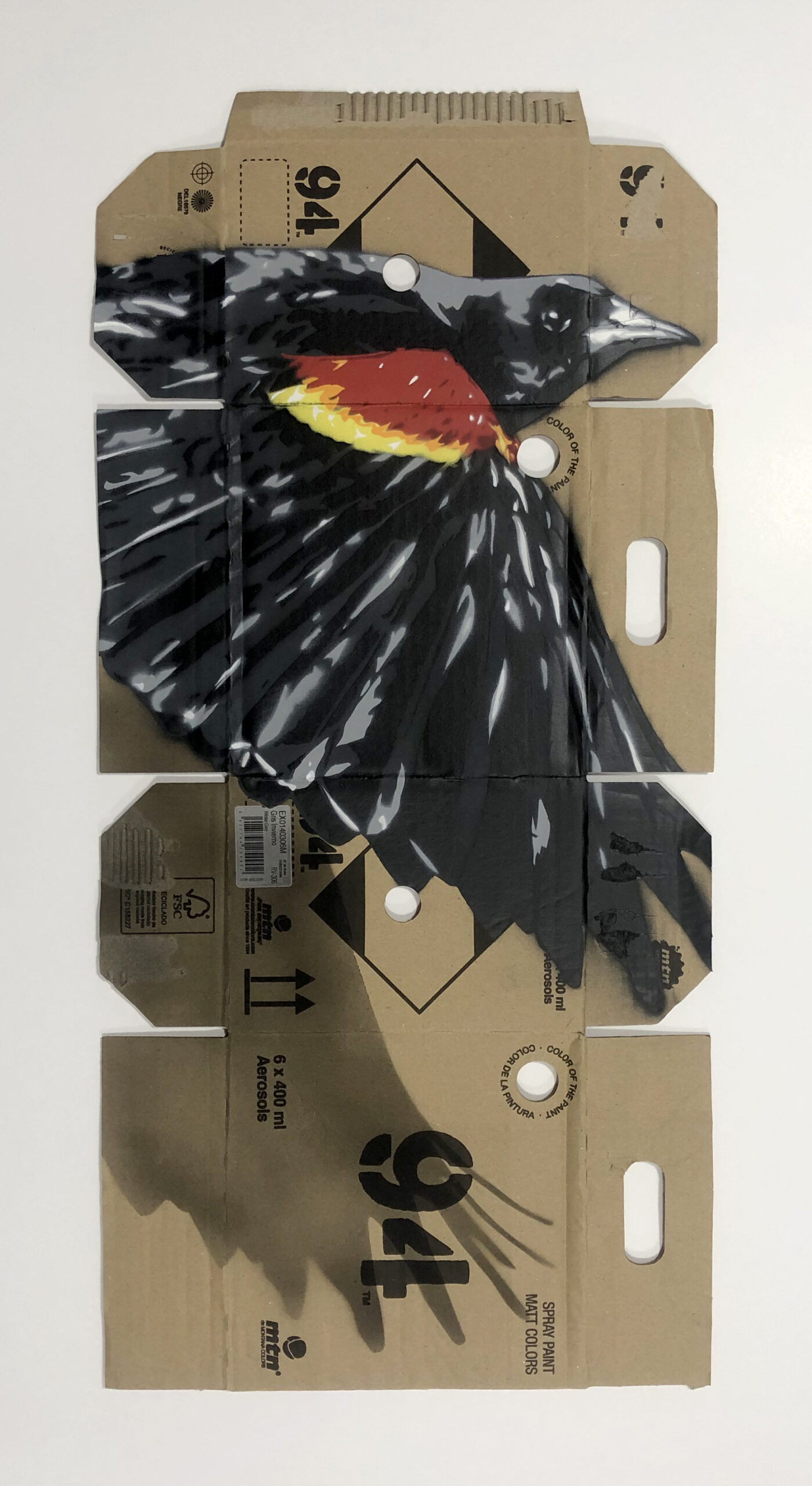
Max Carrier
R!ch Cihlar
As a stencil artist, I blend the gritty, raw energy of street art with the bold, vibrant pulse of pop art, creating works that bridge two exciting worlds. My current series takes that fusion to a new level by using reclaimed cardboard boxes as canvases—specifically, the ones my paint supplies arrive in. The irregular shapes and printed details on the boxes give each piece a unique starting point, a testament to the urban environment I draw inspiration from.
Read More
I’m fascinated by imagery that feels suspended in time, and my work often features birds, fish, or other creatures floating in space, disconnected from gravity. The layering process in stenciling, with each piece built from 8-14 layers, allows me to experiment with depth and color in a way that makes these images feel almost photo-realistic. The final touch—adding drop shadows—creates the illusion that my subjects are hovering just above the surface, giving them a three-dimensional life that leaps out at you.
Painting on found objects has always been a way for me to merge the unpredictability of street art with the precision of pop art. Each new surface offers its own challenges and inspirations. My goal is to create art that’s as dynamic and surprising as the world around me, reflecting both the everyday and the extraordinary in a way that keeps you looking, questioning, and discovering.
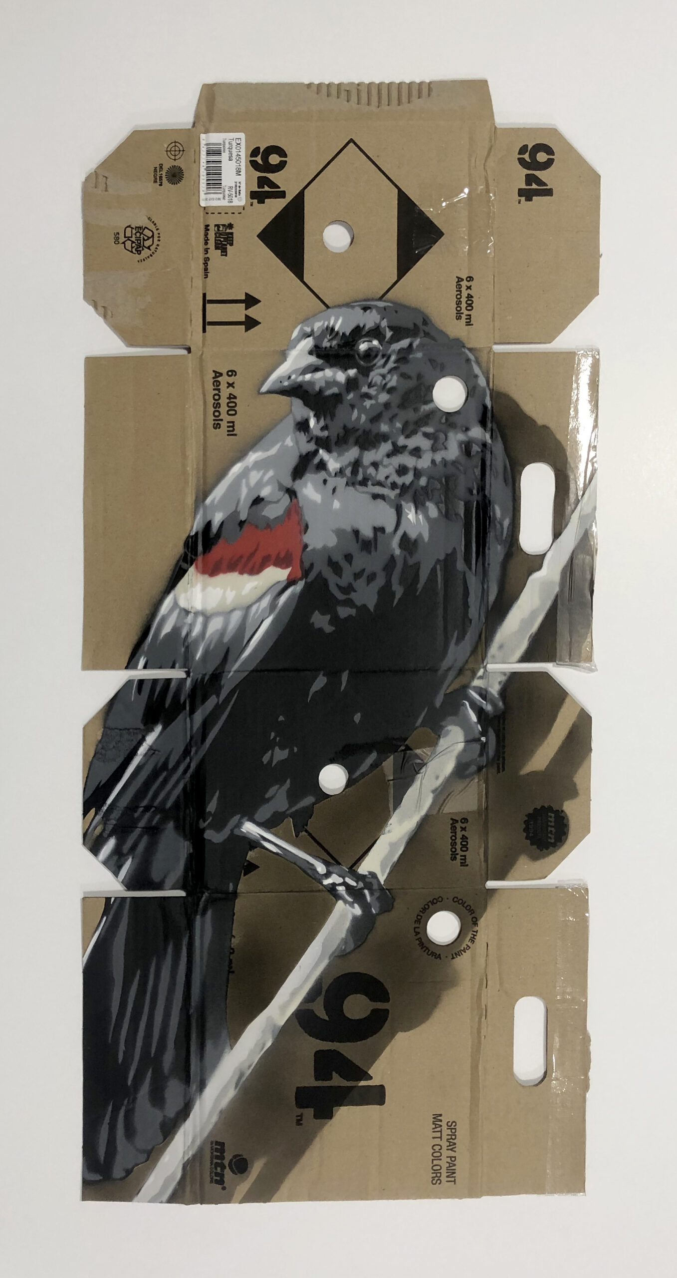
Black Bird 1
Stenciling on reclaimed cardboard, 12″ x 27″
Black Bird 2
Stenciling on reclaimed cardboard, 12″ x 27″
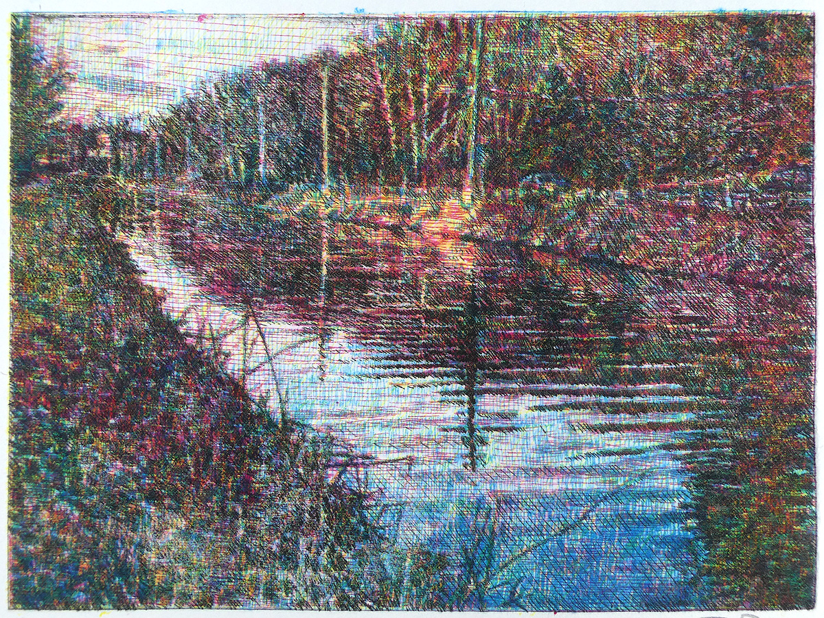
Canal Road
Drypoint on Plexi, 8″ x 6″
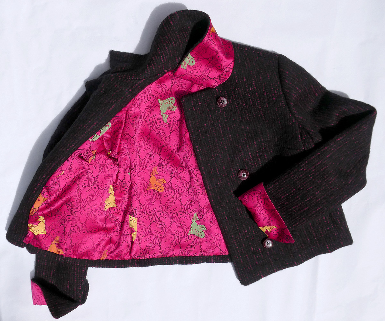
Koi Jacket
Fabric, Print, Cut, Swen, 30″ x 20″
Jeanne Debonis
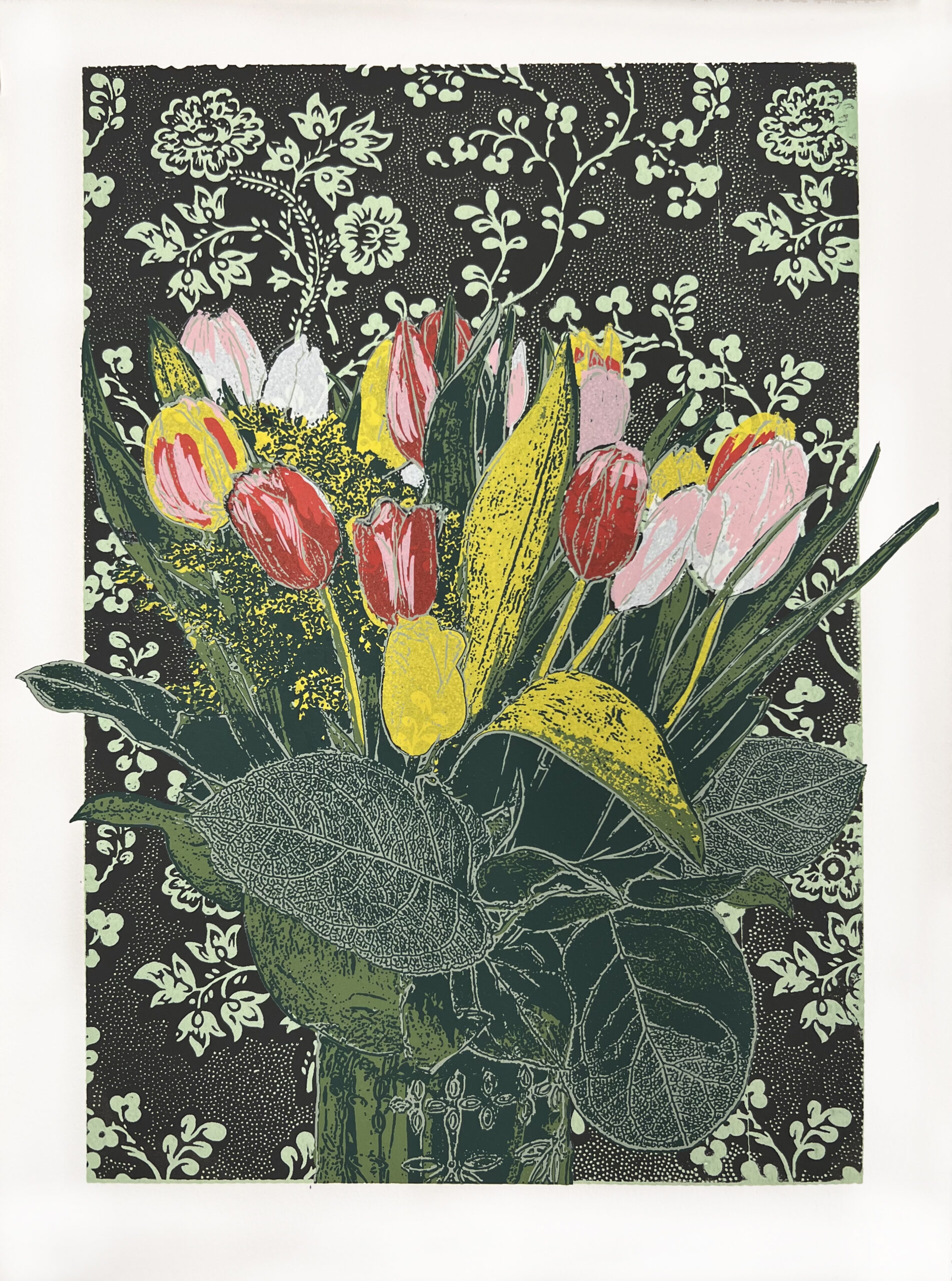
Margaret Denk-Leigh
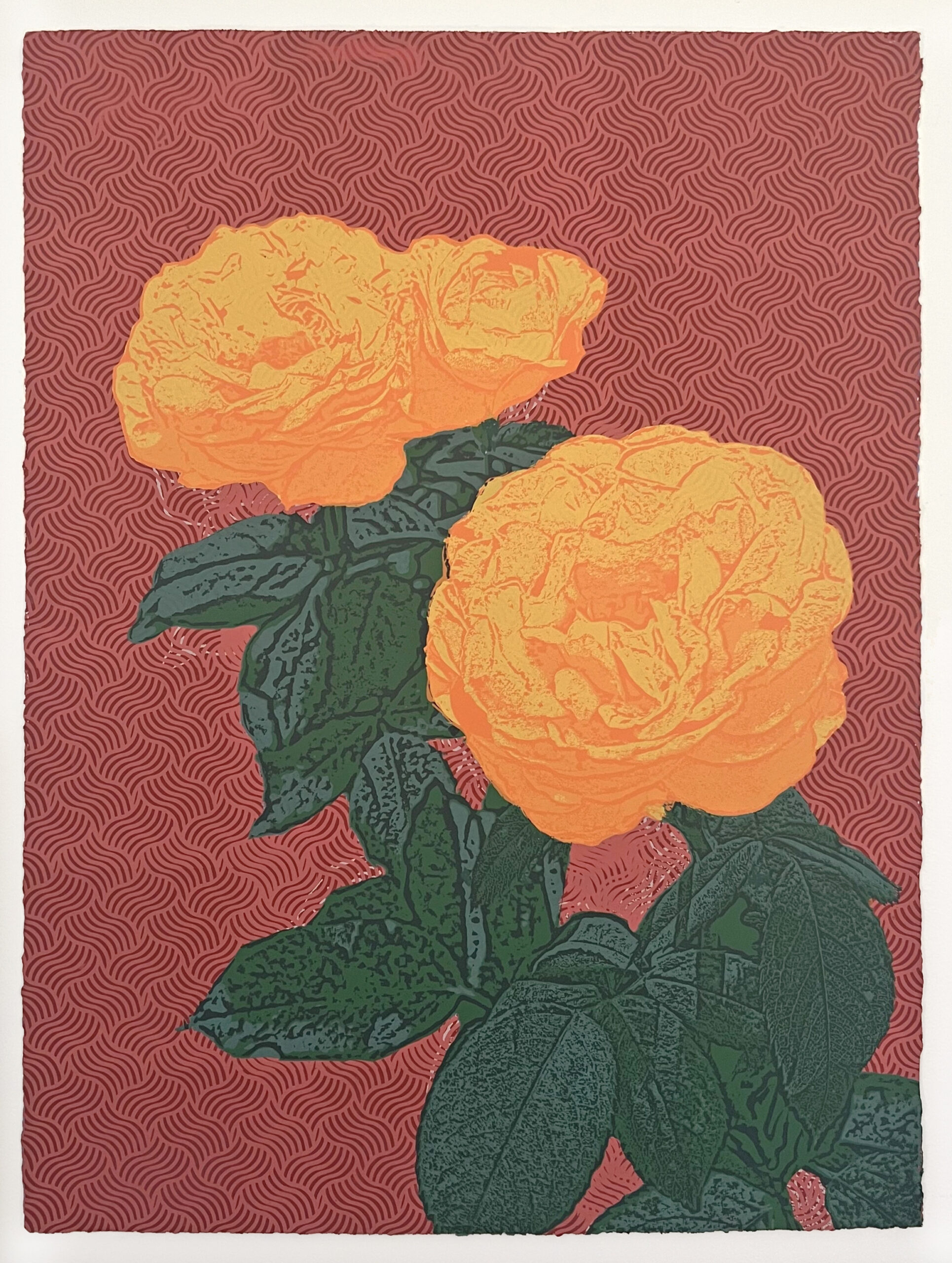
From My Grandmother’s Garden 4
Screenprint on Rives BFK, 22″ x 30″
Thinking of You
Screenprint on Rives BFK, 11″ x 15″
A Rabbit’s Adventure
Linocut, 12″ x 16″
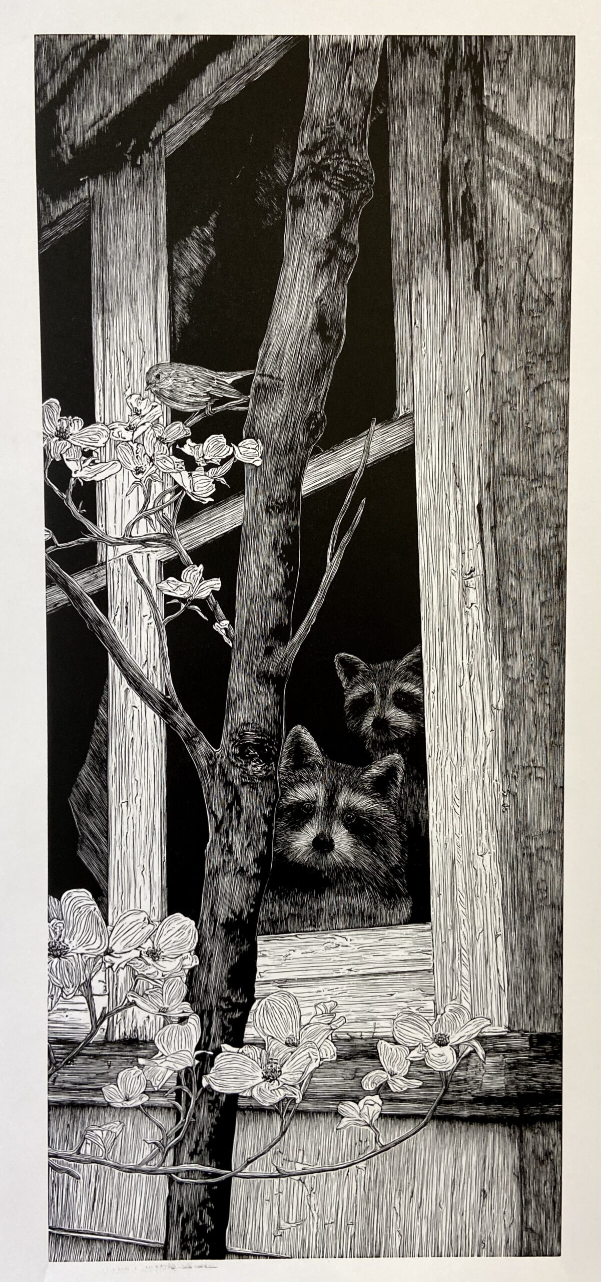
Cottage Dwellers
Woodcut, 12″ x 28″
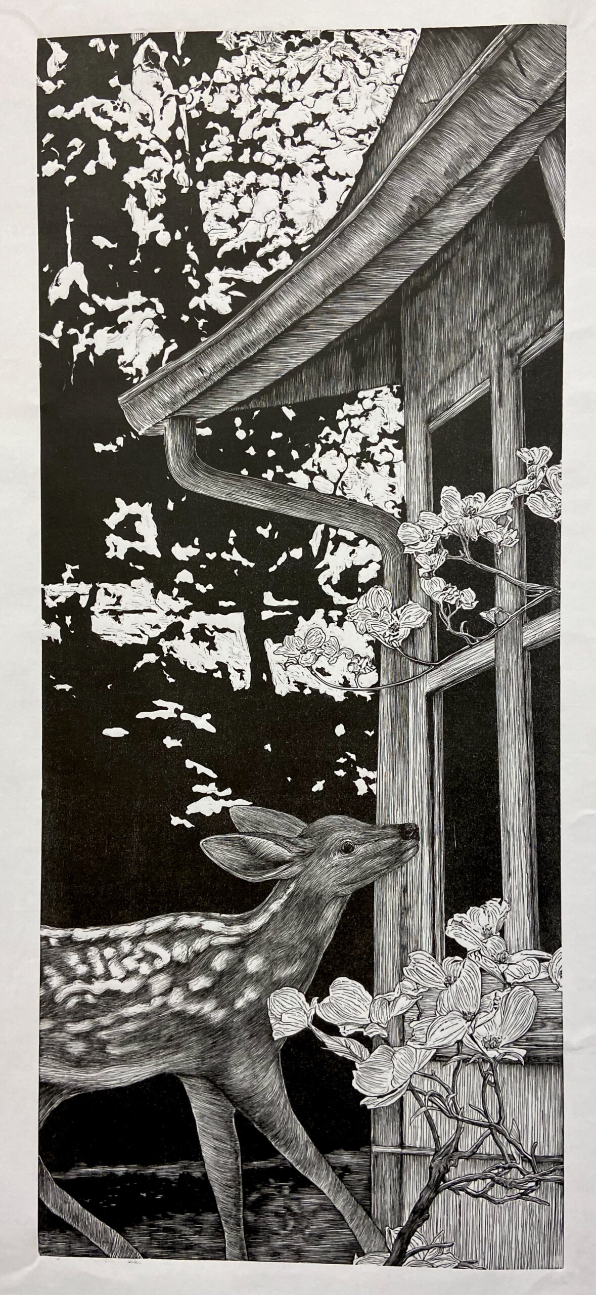
Cottage Visitor
Woodcut, 12″ x 28″
Amanda Dilisi
I use a traditional relief printmaking technique, printing with black ink on white paper. My printmaking pieces, Cottage Dwellers and Cottage Visitor, are carved into Shina Plywood. I primarily use a 1.5mm V Gouge Carving Tool to create intricate lines and details. My printmaking piece, A Rabbit’s Adventure, is carved into linoleum. My artwork portrays the effects of time passing, with the unavoidable weathering it causes, despite efforts to maintain and preserve the original condition. The concept of aging and reluctantly letting go are highlighted by contrasting neglected man-made objects with the beauty and wonderment of nature. Whimsical animals in nature symbolically bring life and hope to an otherwise lifeless, overgrown or forgotten scene. Many of my pieces depict familiar family objects that have deteriorated due to the passage of time.
Claudio Orso Giacone
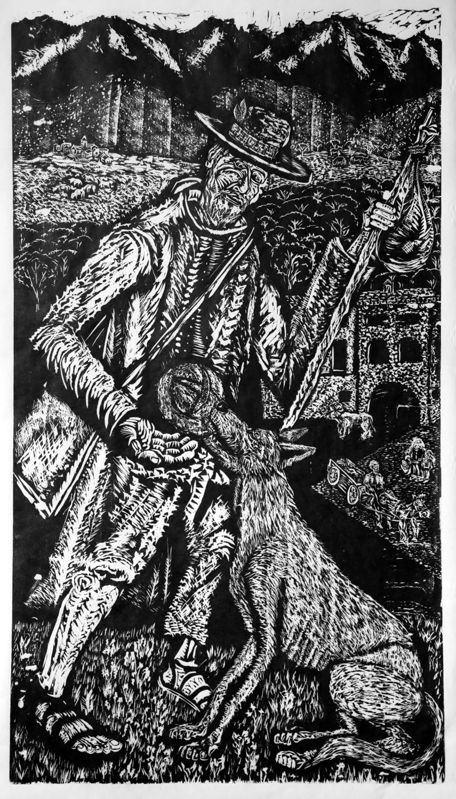
Traveler of Miracles
Hand-printed Woodblock, 17″ x 29″
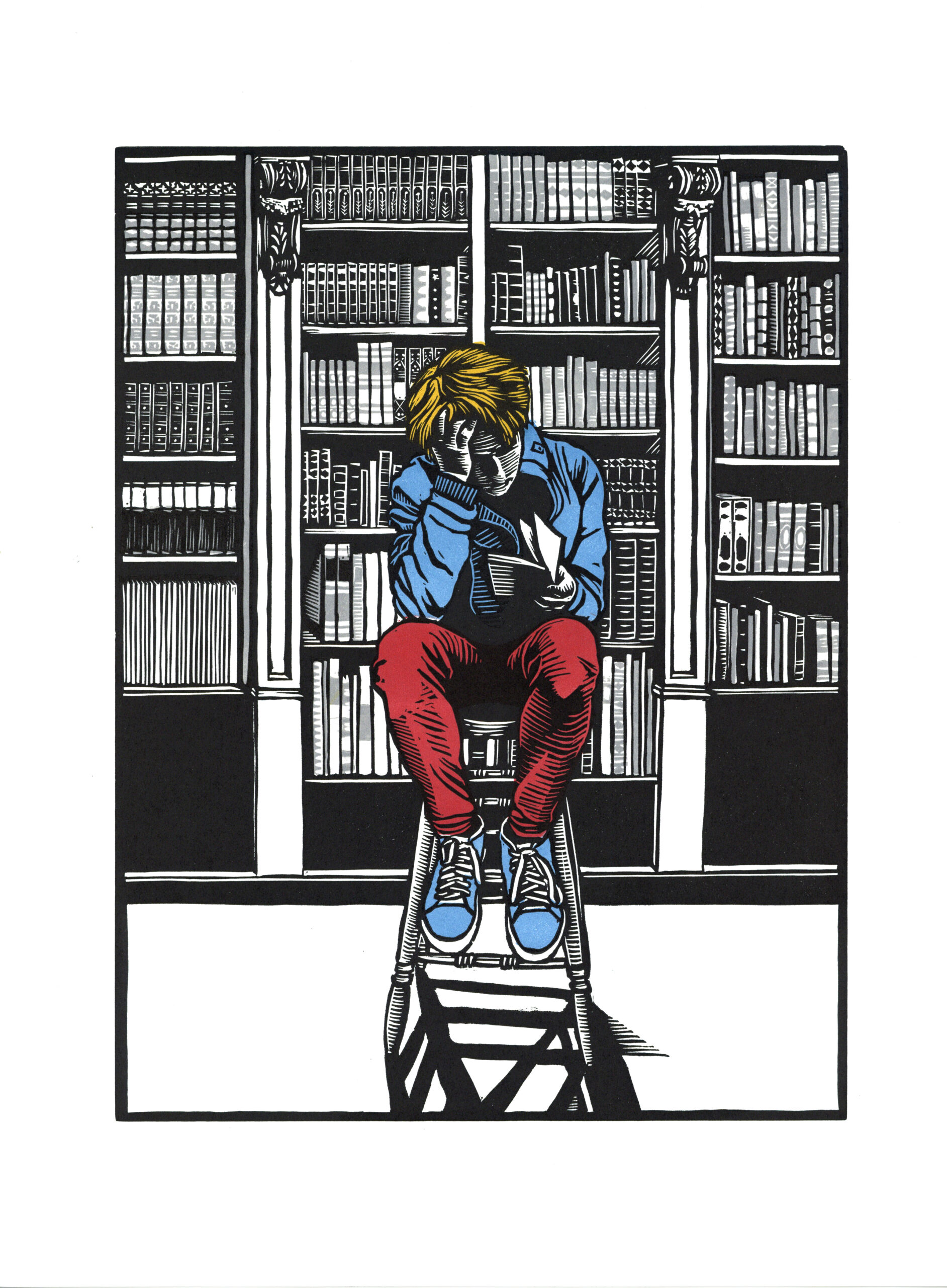
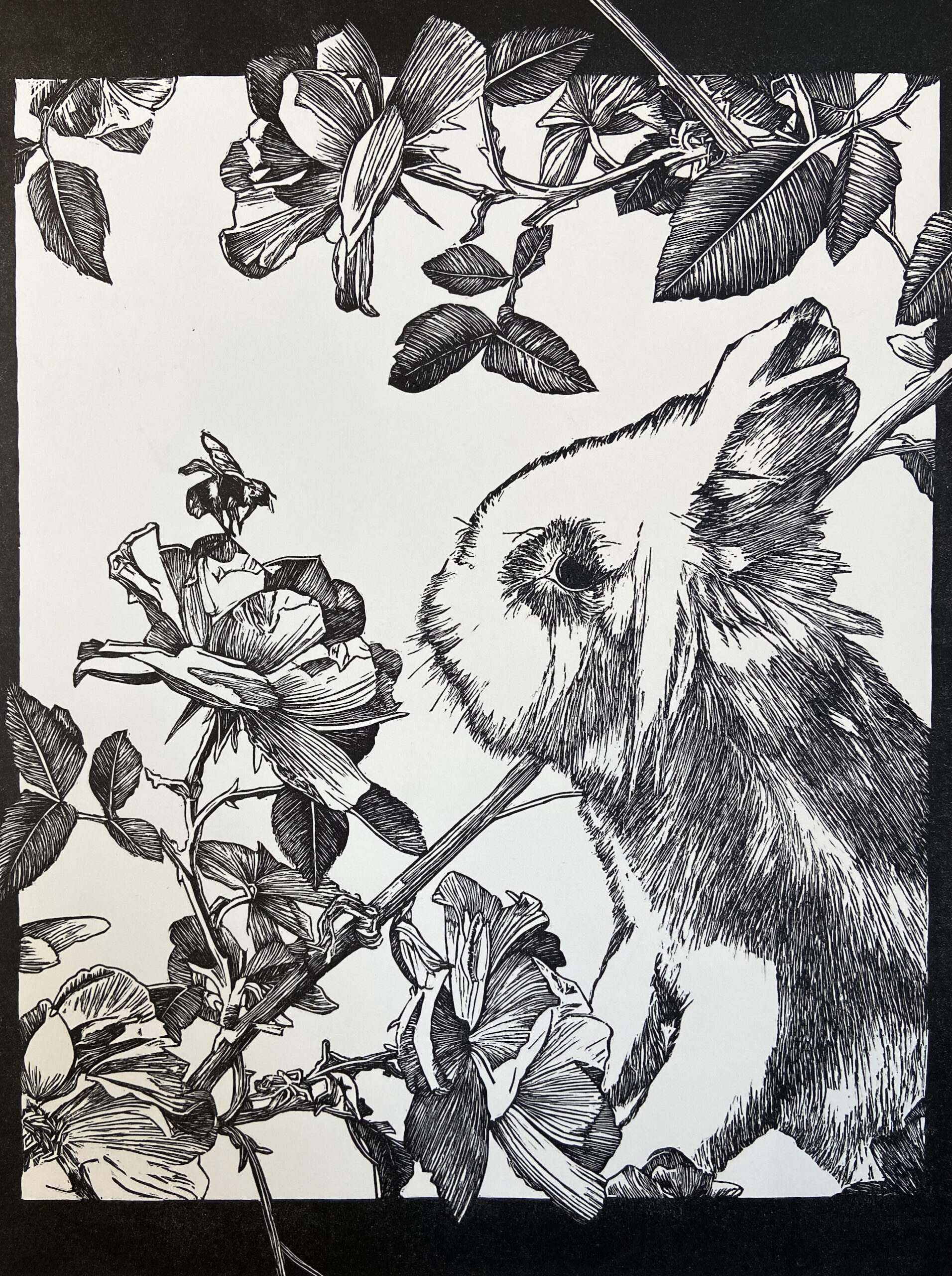
The Reader
Linocut printed in color, 11 x 14″
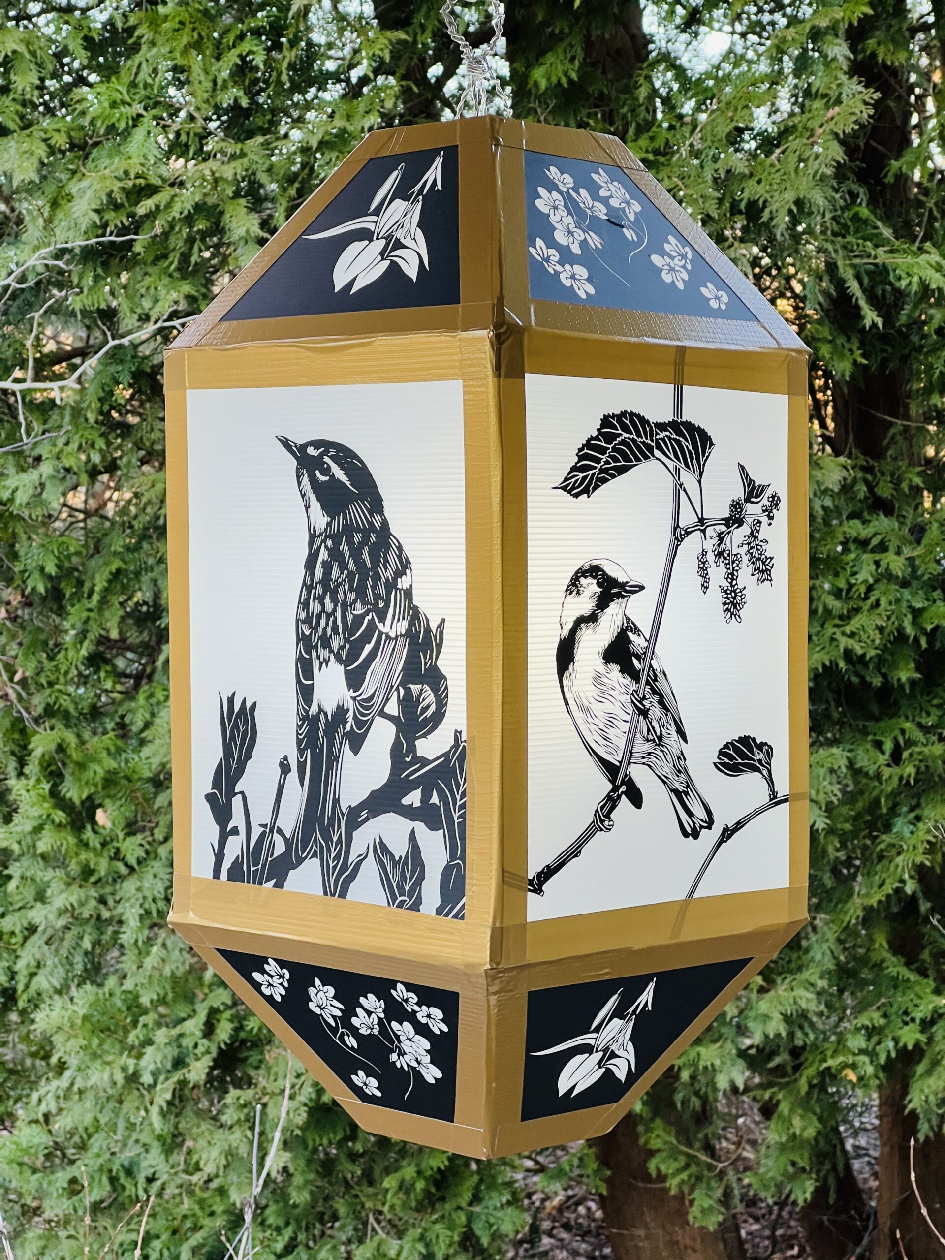
Light as a Feather
Coroplast, duct tape, vinyl, and aluminum wire 24″ x 12″ x 12″
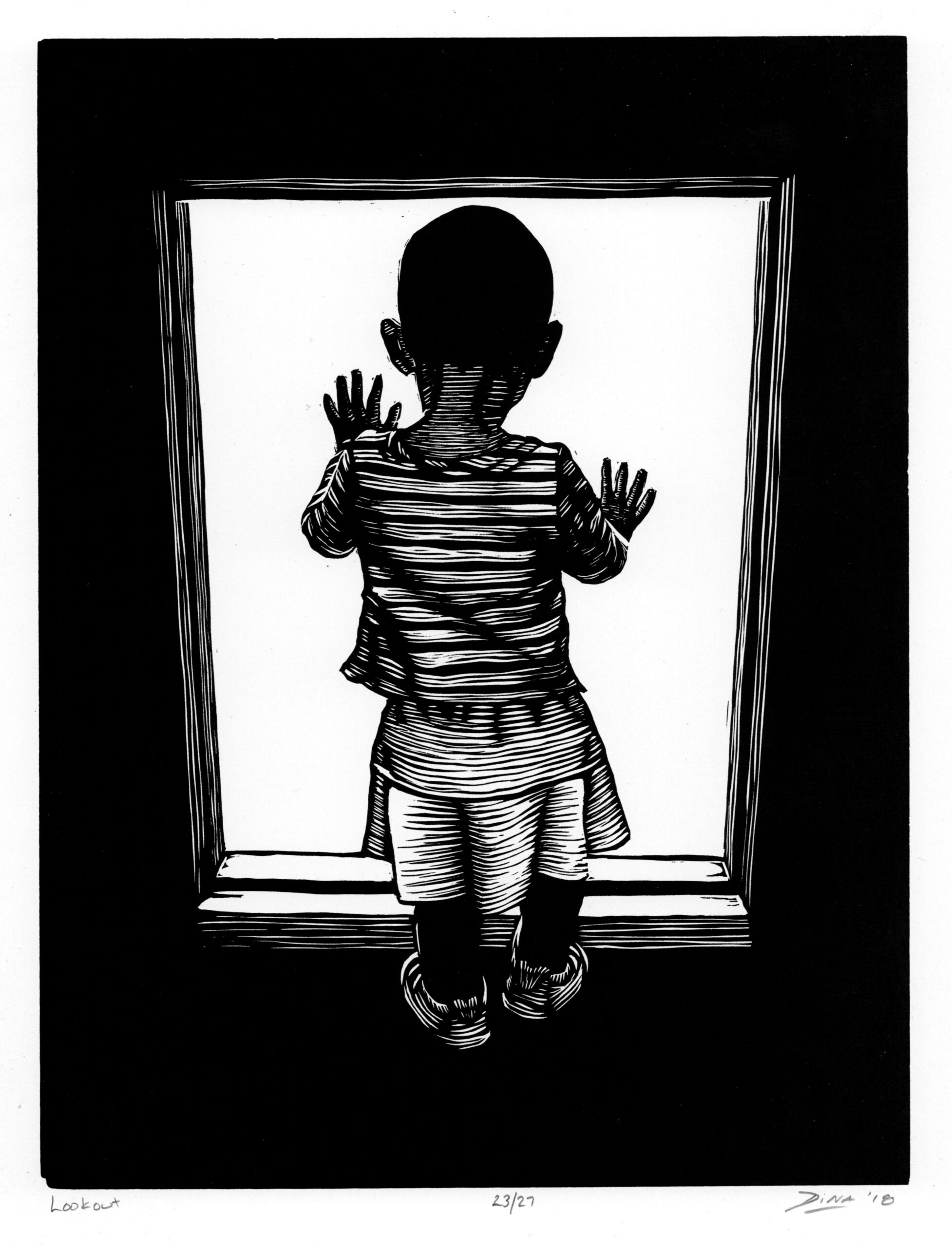
Lookout
Linocut 11″ x 14″
Dina Hoeynch
Layla Harris Hyman
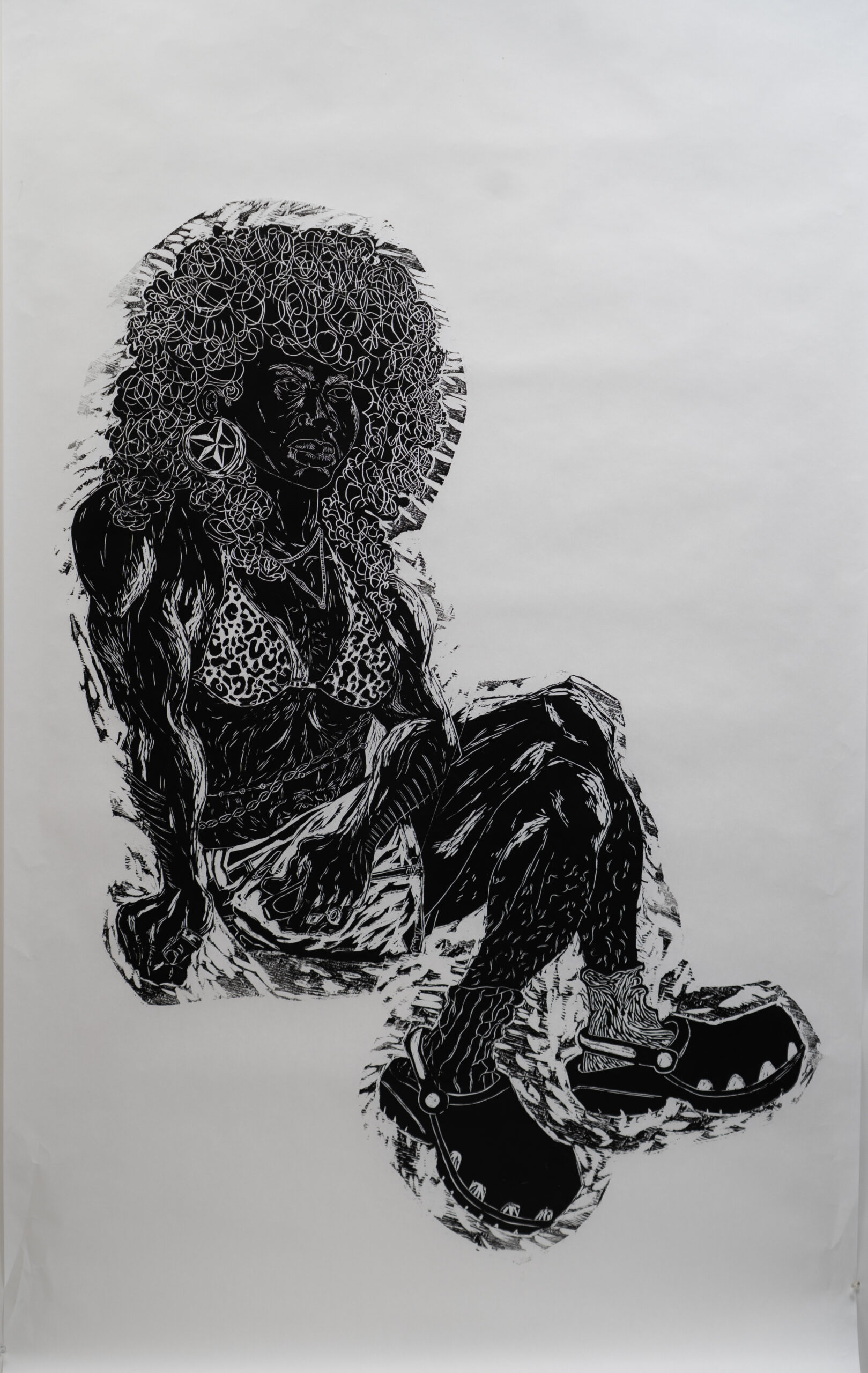
Lady in the Crocs
2024, Relief Print, 70″ x 40″
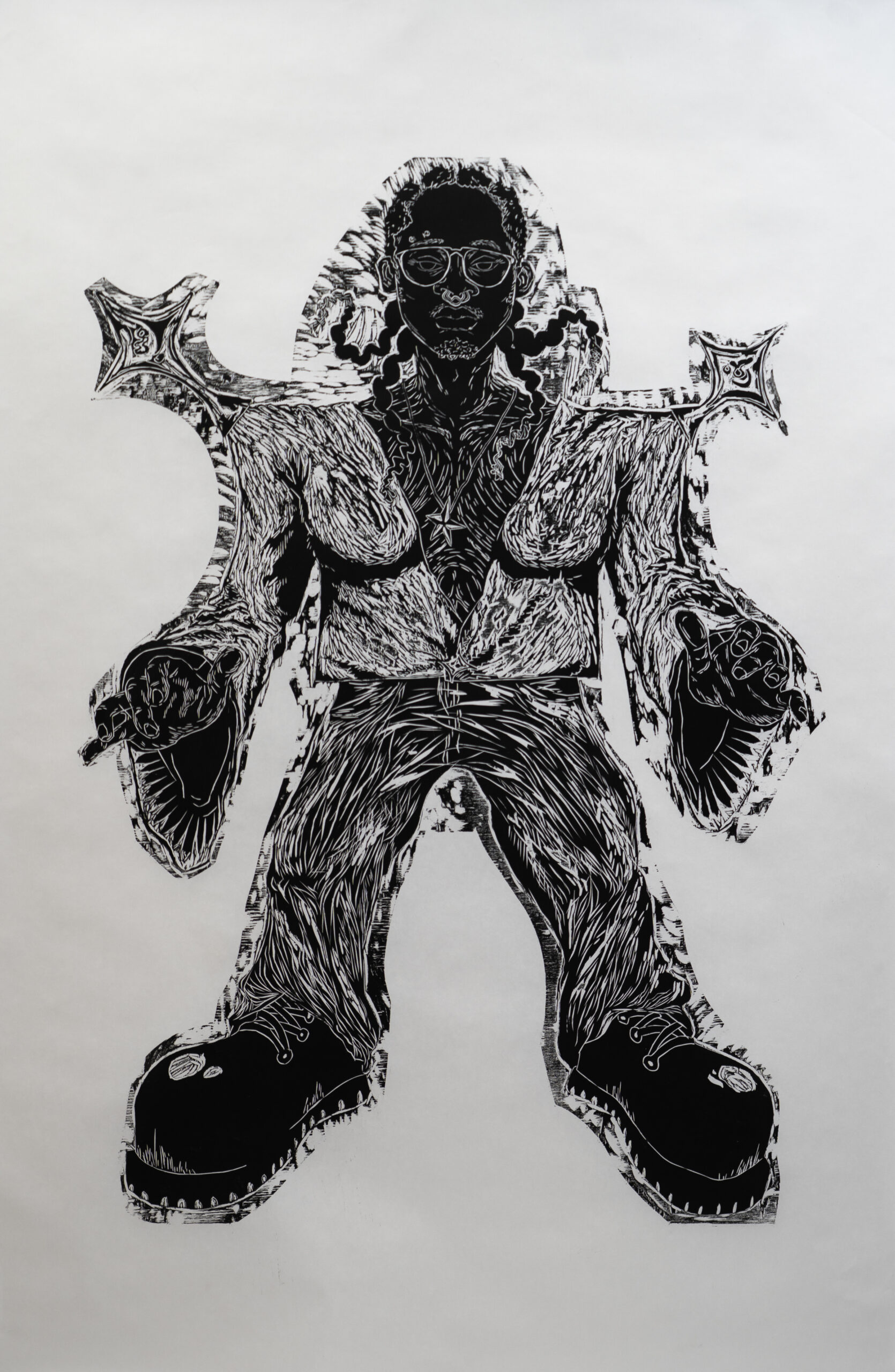
Lesbian Wizard
2024, Relief Print, 65″ x 40″
Cheeky Monkey
Copper Plate Etching on Rives BFK, 9″ x 12″
Floaters
Woodcut on Shina Plywood, 20″ x 32″
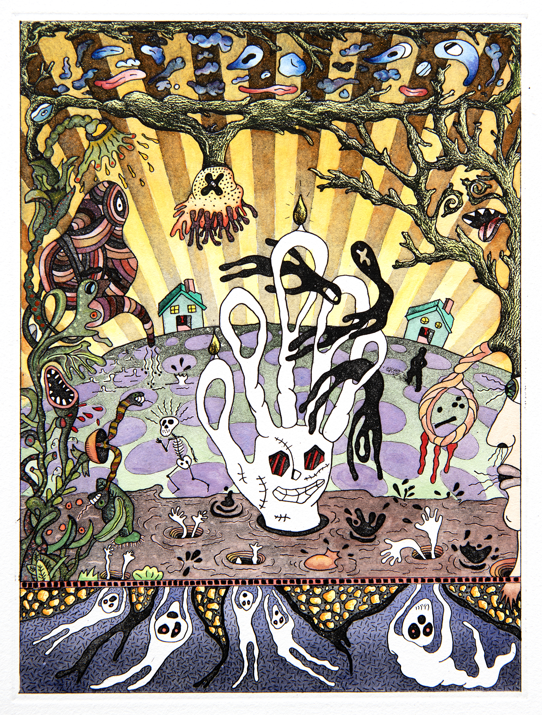
Hand of Glory
Copper Plate Etching on Rives BFK with Watercolor Washes, 9″ x 12″
Paul Jacklitch
Step after step, after step, each process adding to the printed image has always been the appeal of printmaking and why I became interested and passionate in the medium over 40 years ago. I love process and how combining, altering, and experimenting with each step can change the end visual result. The works in From Woodblock to Inkjet, show numerous processes each varied and conclude in beautiful works of art. I’m proud and honored to be part of this exhibition as I exhibit a woodcut and etchings.
Read More
A woodcut, does not present much process, its a very simple and direct approach to making a print. A block of wood, carved with simple tools, rolled with ink and offset onto paper. Floaters is an old etched image I reworked and designed for the woodblock carving. I always liked the image, but it never worked as an etching, so I pushed it into a relief design. Using the proportions of the pupil to iris to eyeball, I designed the elusive “floating” characters that appear to often cover the surface of your eye.
An etching can contain many varied processes developed one after another on the copper plate, building a final image. My two displayed etchings, The Hand of Glory and Cheeky Monkey take advantage of basic etching techniques of line and aquatint. I did vary each to yield different visual results. After working exclusively on zinc plates for decades, these two prints represent the first few works on copper using ferric chloride as my mordant. The change in materials has affected the work, and I’m quite excited by the results. I built an aquatint box and for the first time am using rosin as my aquatint ground. I enjoy using this traditional rosin ground for the fine grain along side the modern use of grainy, spray paint aquatint.
My imagery is playful, building from a cast of characters I’ve developed over the years and continue to develop influenced by reading (currently The Divine Comedy) and drawing from imagination while designing them into narrative, surreal landscapes. The final step in my process is to paint the prints with washes of watercolor.
Yuko Kimura
Shiwa Shiwa means wrinkle wrinkle in Japanese.
My unique printmaking process was developed by experimenting with a traditional Japanese resist dye technique called Shibori.
Paper is tightly wrapped around a pole and then the paper is compressed from top to bottom on the pole and pleated. After the wrinkled paper is taken off the pole then it is laid flat and printed. The pleats act as a resist when printed in relief or intaglio using a metal etching plate. Inked is rolled on the surface of a copper etching plate and then printed making a relief etching and ink is pushed down into the lines and wiped off the surface for traditionally printed intaglio results. Either the pleats stay pleated or are opened; as a result, striations and unique linear marks, are created in the paper.
Read More
The “Blue Shiwa Shiwa l” is a combination of etching and relief etching printed on a pleated new abaca handmade paper and antique woodblock printed book pages.
The left side of the “Blue Shiwa Shiwa ll” resembles weaving. The antique woodblock printed book pages are pleated, printed, opened, sliced into thin strips and collaged together. Then the strips of prints were partly twisted to create threads and woven. The right side of the “Blue Shiwa Shiwa II” stayed pleated after printed.
In ancient Japan, paper thread (koyori) was made and used in daily life. People used it for making baskets, weaving paper threads (Shifu) for Kimonos and also used for binding books.
Although my use of aged paper can evoke a nostalgic, antique quality, my innovative printmaking practices focus intuitively in the present. For me, transparency, form, and texture all take priority as I construct my two- and three-dimensional patchwork experiments.
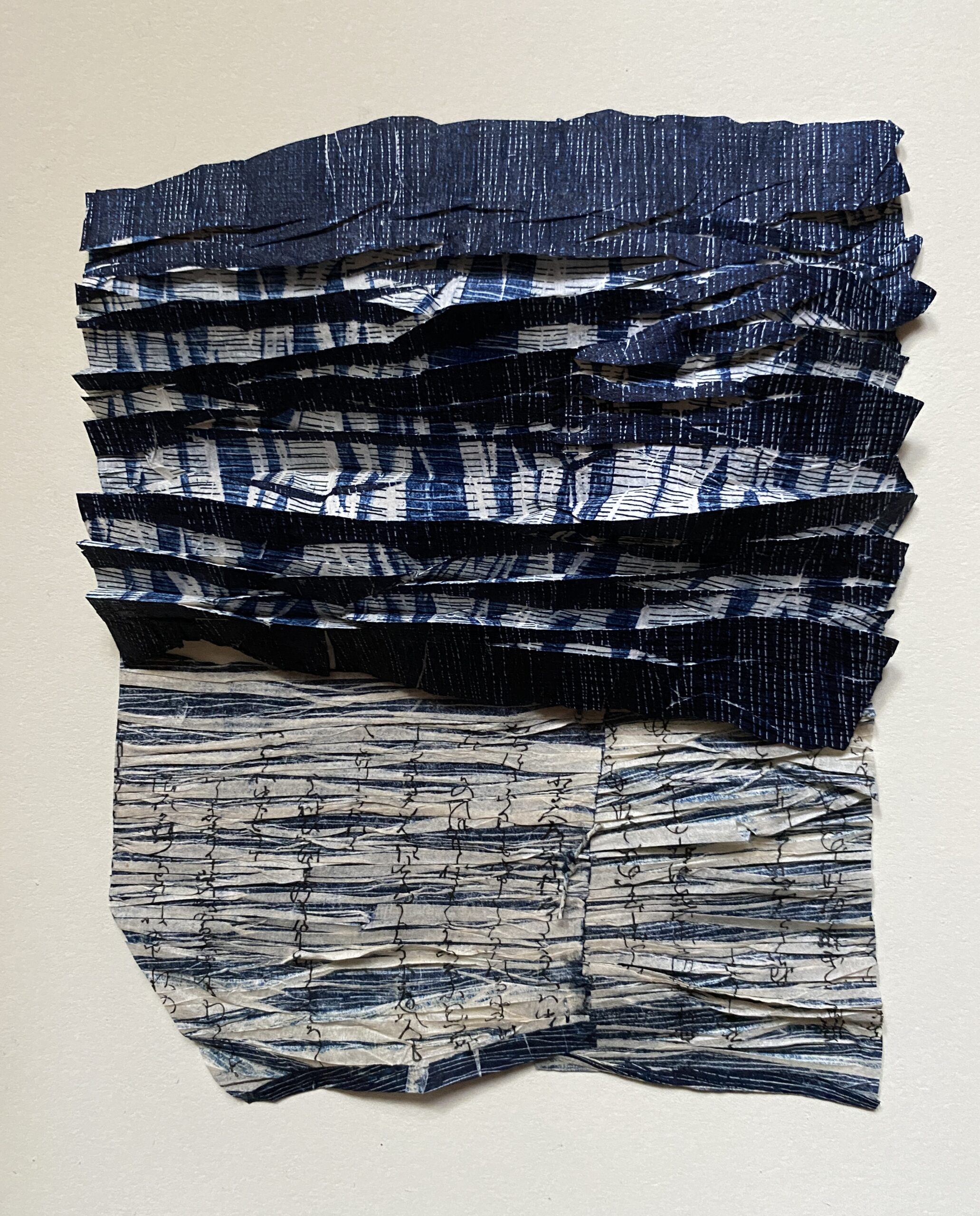
Blue Shiwa Shiwa (Wrinkle Wrinkle) I
2024, Etching and relief etching on pleated abaca handmade paper and antique woodblock printed book pages (old mulberry paper) from Japan, collage, hand twisted paper thread, 5.75″ x 7″
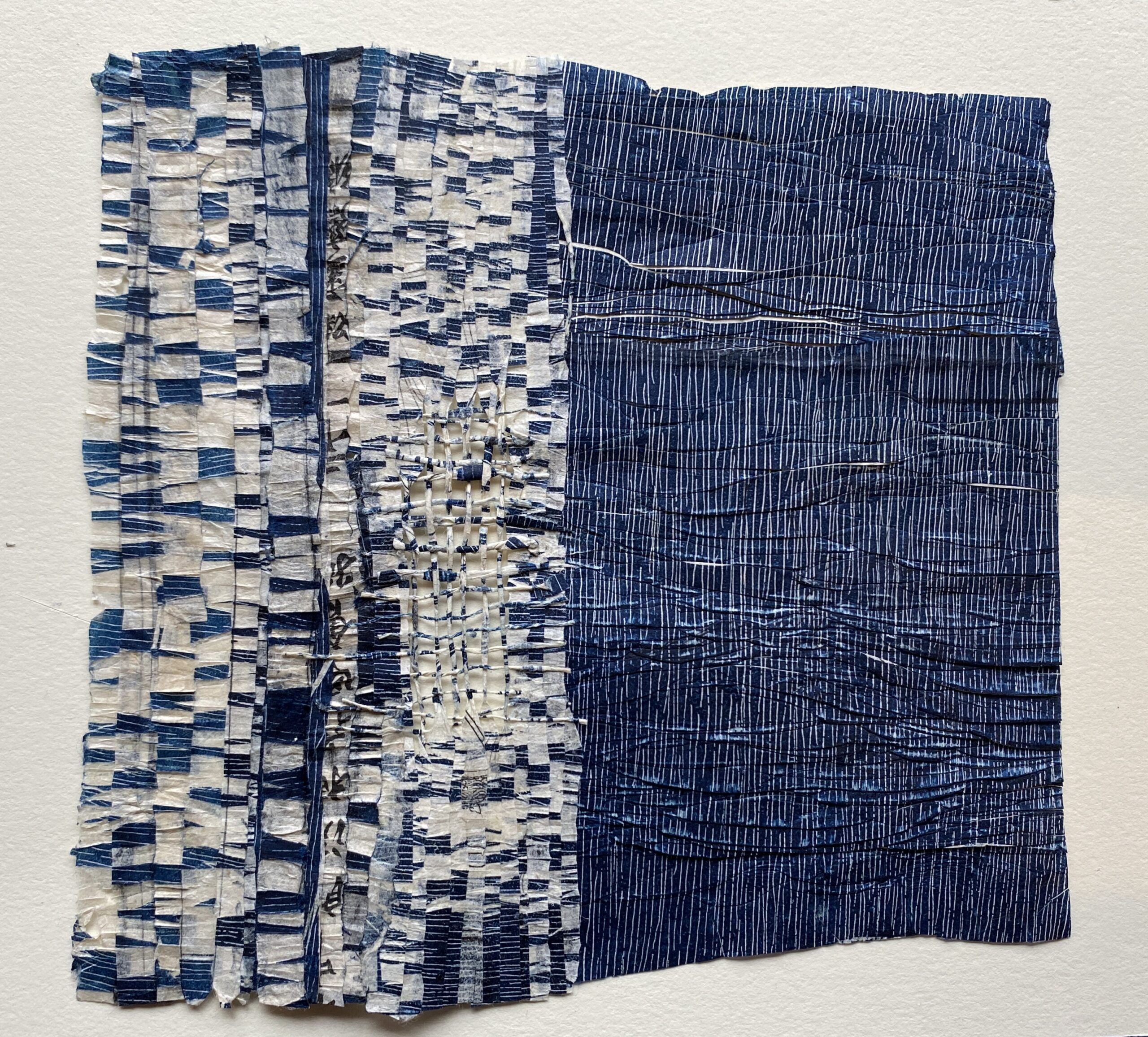
Blue Shiwa Shiwa (Wrinkle Wrinkle) ll
2024, Relief etching on pleated antique woodblock printed book pages (old mulberry paper) from Japan, collage, hand twisted paper thread, 7.5″ x 8″
God is in the Details 11
Woodcut prints on BFK, 24″ x 18″
Jennifer Leach
Erica Lull
Vector Brain, Raster Brain is an inkjet poster series playing off the left-brain, right-brain myth. The left-brain thinker is logical, calculated, and methodical, while the right-brain thinker is creative, emotional, and imaginative. Working within these confines of the myth, each poster uses a different digital space to visually represent each side of the brain.
Read More
Vector Brain (left-brain) is designed in Adobe Illustrator, a vector-based program utilizing math to calculate and draw the lines and anchor points that form each graphic. A scanned and vectorized hand-drawn image, provides the basic structure of the left brain. Custom and stock images of scientific, equations, language, patterns, code, glyphs, and electronics make up the Gyri and Sulci (outward and inward folds of the brain). Following a grid, systematic design decisions allow for repeating elements, organization that mimic a detail-oriented mindset. Vertically arranged type describes different left-brain functions in Alga Regular, a serif typeface with open counters to facilitate easy reading. In contrast, different diseases that can affect the brain are represented in the clean san serif Massilia Bold, void of excess decoration as a nod to analytical thinking. The many applications of the imagery, such as blueprints and code, designate blue as the primary color of this piece. The complementary color orange adds a vibrant burst of color to draw the attention of the viewer.
Raster Brain (right-brain) is created in Adobe Photoshop, a raster-based software program where the manipulation of individual pixels forms the visuals. The digitized hand drawn graphic keeps its raster format as the base of the layout. Photographs within the Gyri and Sulci explore what it means to be “creative.” Photoshop filters manipulate parts of the original drawing before blending layers and image masks collage each photograph. Consistent with a series, the same typeface represents the vertical type as right-brain functions. Massilia represents results or conditions caused by brain events. Splotches of color bleed into the background blurring the edges allowing for free flow of creativity. Purple represents creativity with yellow allowing for eye-catching contrast.
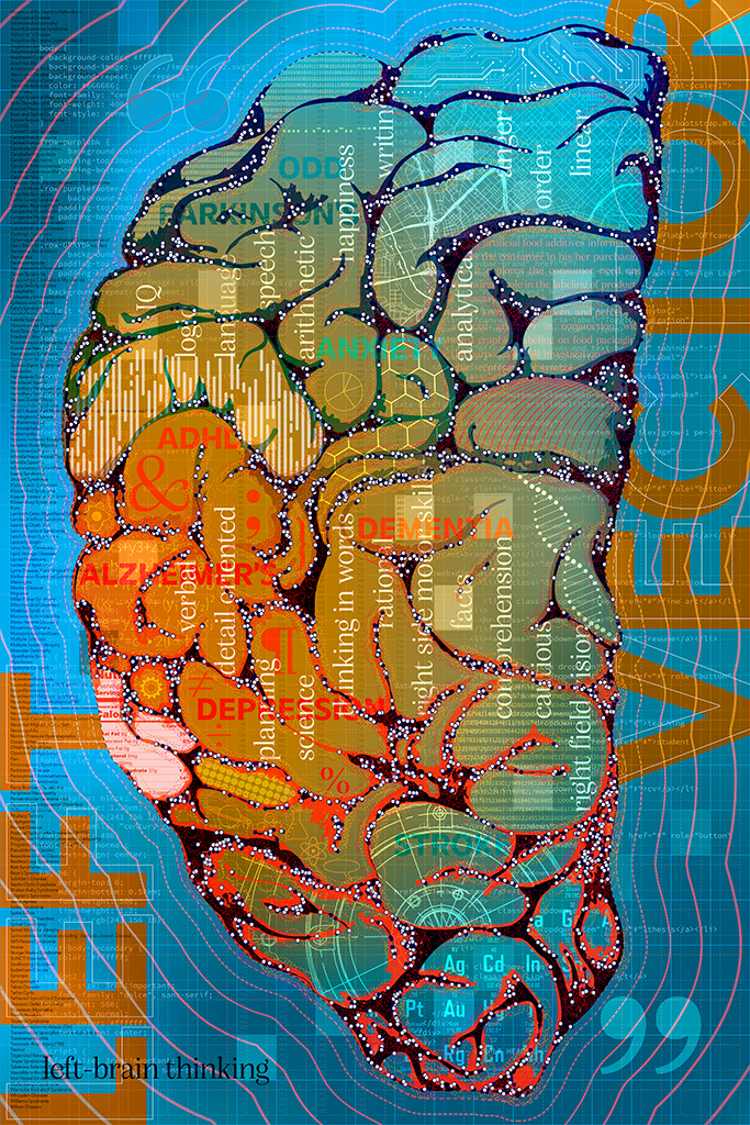
Vector Brain
Inkjet, 24″ x 36″
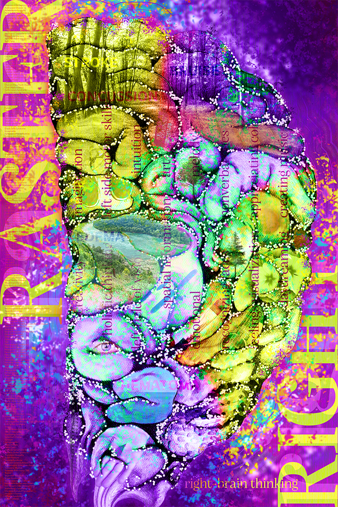
Raster Brain
Inkjet, 24″ x 36″
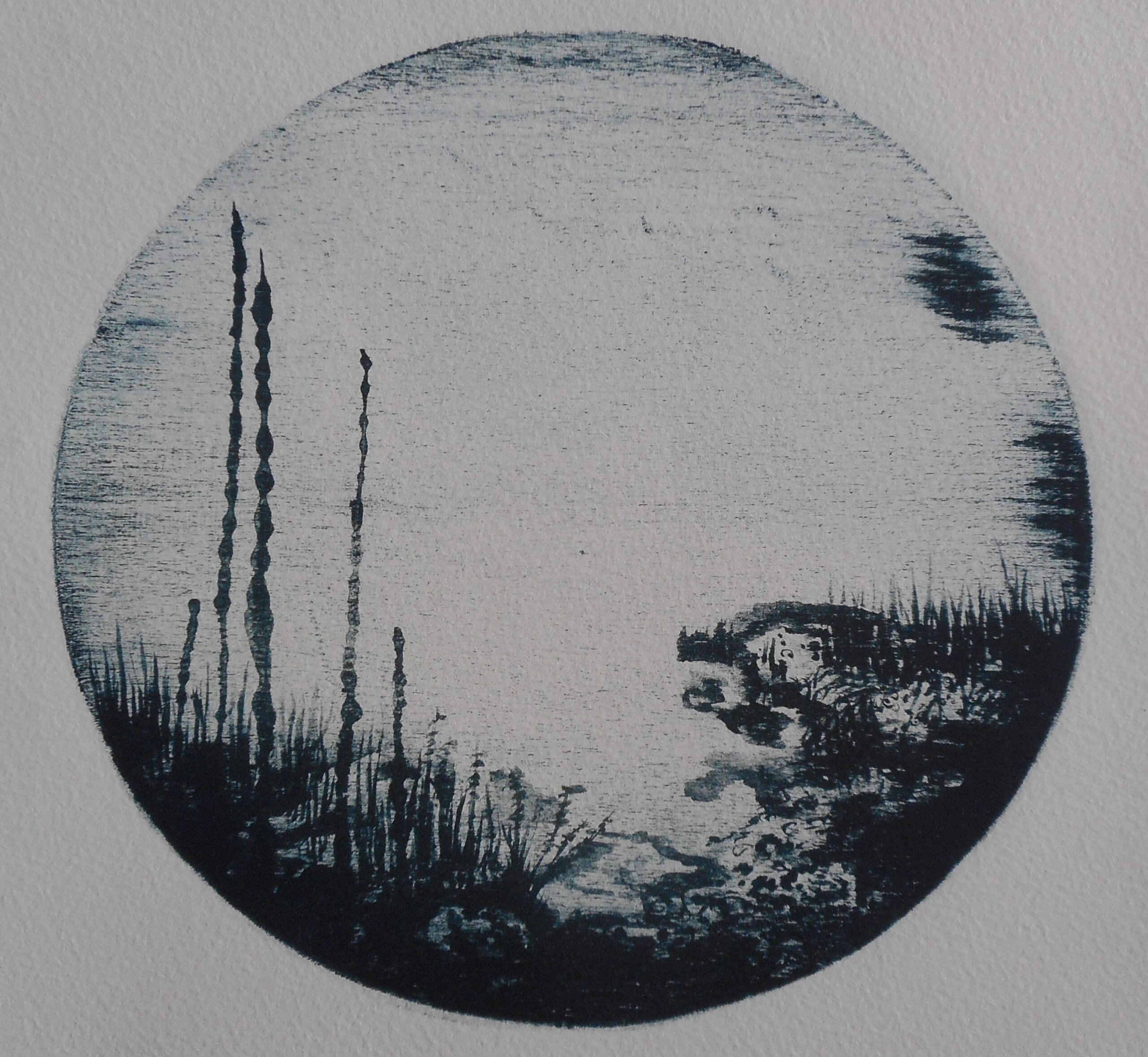
Plan Depth 25 ft
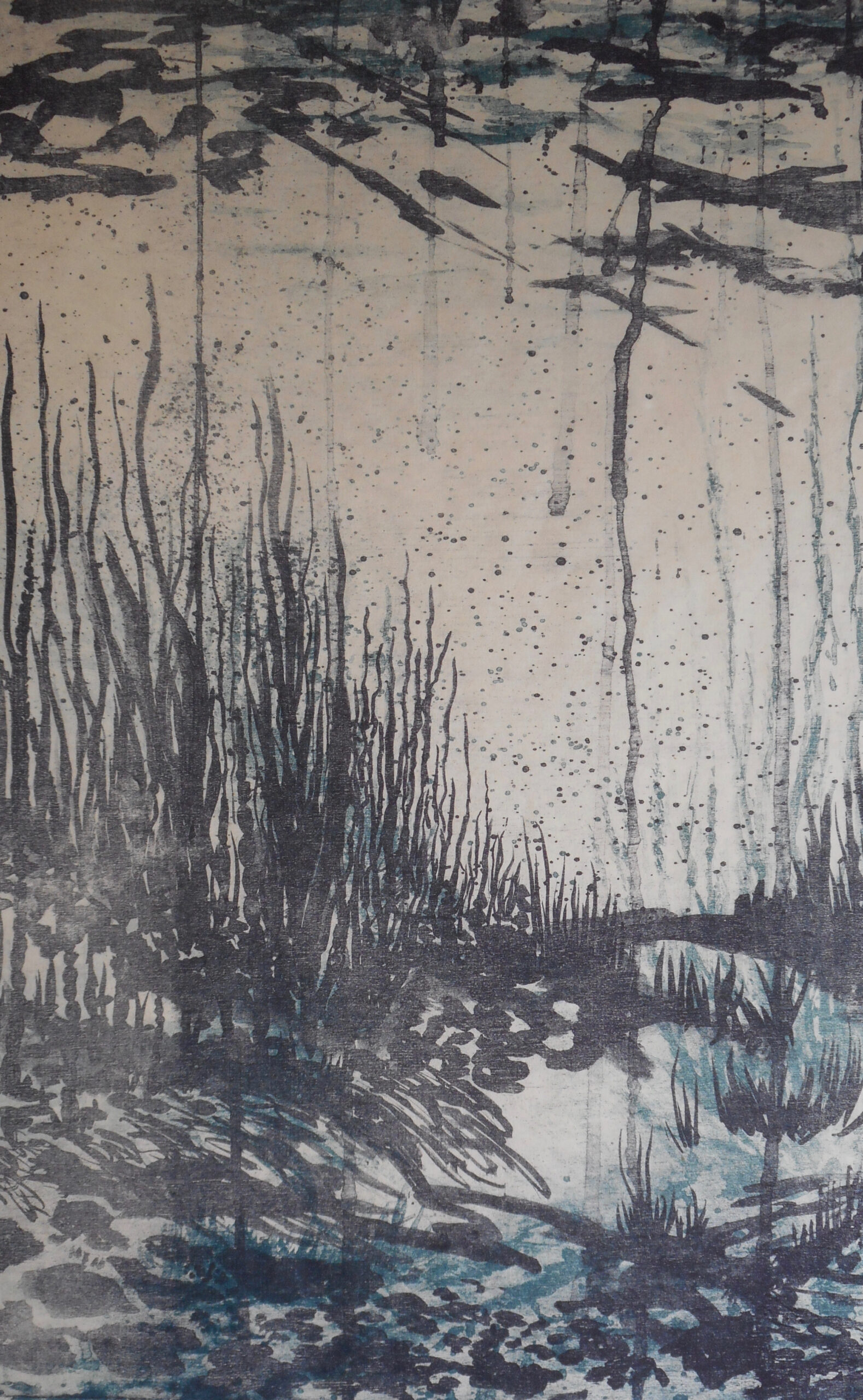
Quarry Dive 2
Michaelle Marschall
Quarry Scuba Diving
Charted depths and time manifest into an exploratory venture incrementally experienced. With a lack of clear vision, a naturally abstracted underwater world engulfs me. Guided further by what is seen, yet obscured, I move onward, only later to recall in print.
The landscape or underwater imagery begins with mark making. The experience is conveyed through a building up of marks on wood, that is then inked and transferred. Some marks reflect actual depths reached in a dive, while the hidden or unseen is replaced with the imagined. The combination of these creates a place that cannot be explored — a space that cannot be charted, logged, or revisited.
Read More
The dive, just as wood lithography, has its limits. The observed environment in a dive is fleeting; time, vision and mobility are competing factors. The inked wood block. a clearly printed image, re-inked and printed again, eventually develops tones, allowing shadow areas to become muddied and obscured. Infused with ambiguity, altered scale, and organic material, the works echo one’s ever-changing perception in the transition from focused to unrecognizable.
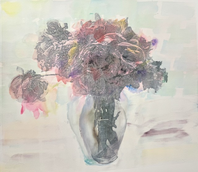
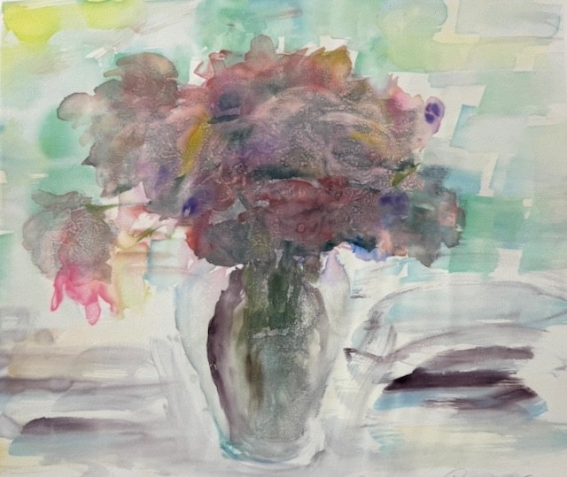
Taryn McMahon
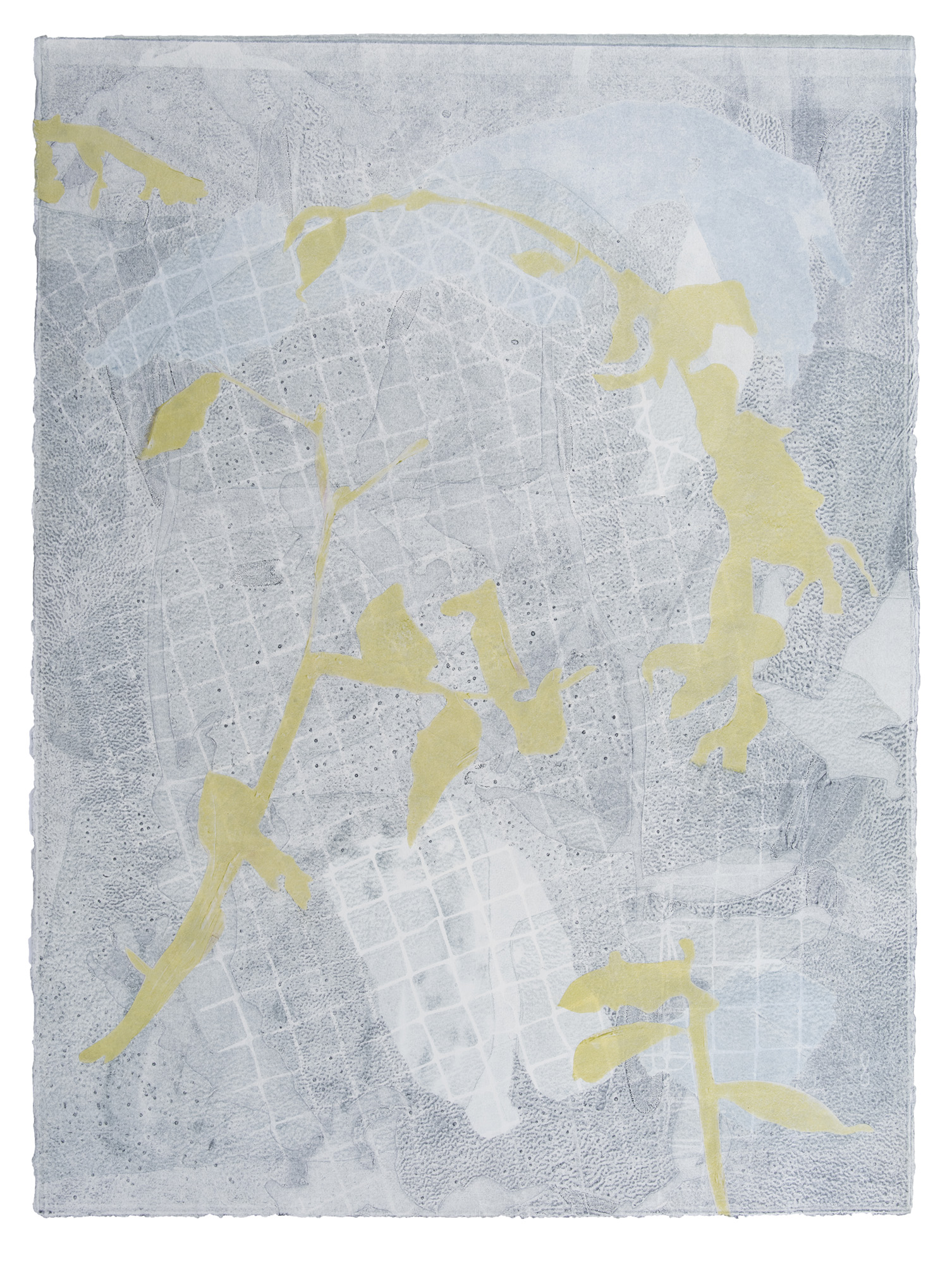
A Series of Entanglements 08
2021, Monotype and chine colle, 30″ x 22″
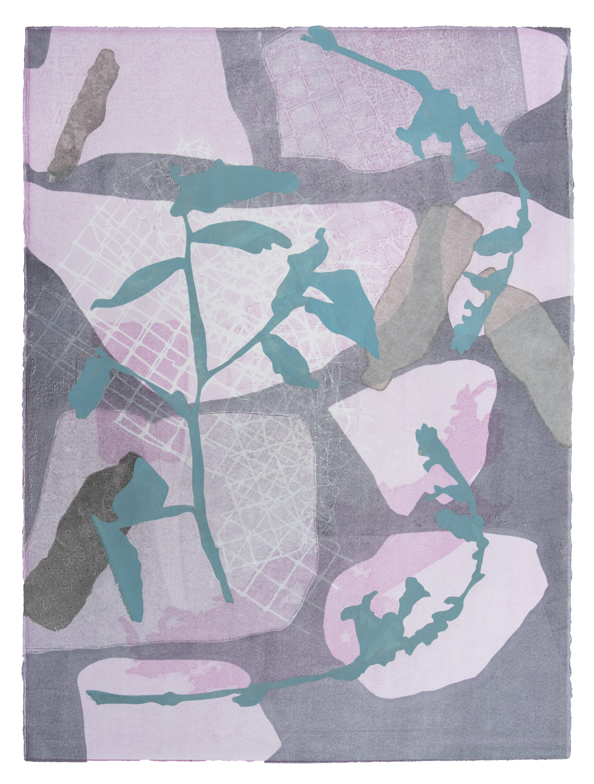
A Series of Entanglements 11
2021, Monotype and chine colle, 30″ x 22″
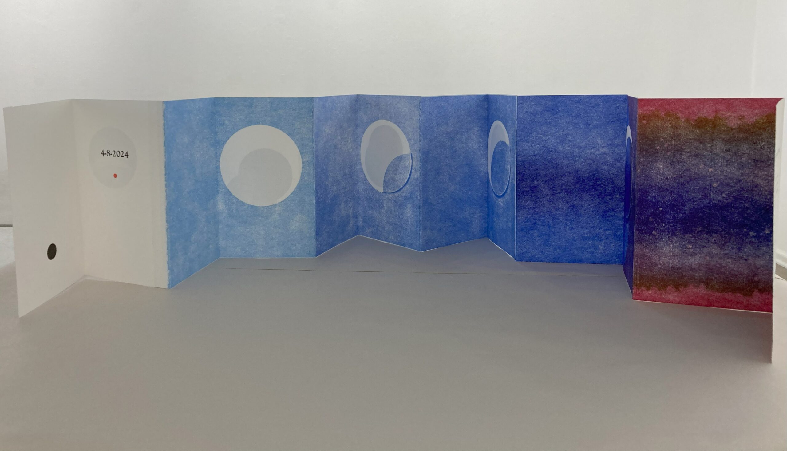
4-8-2024 (1)
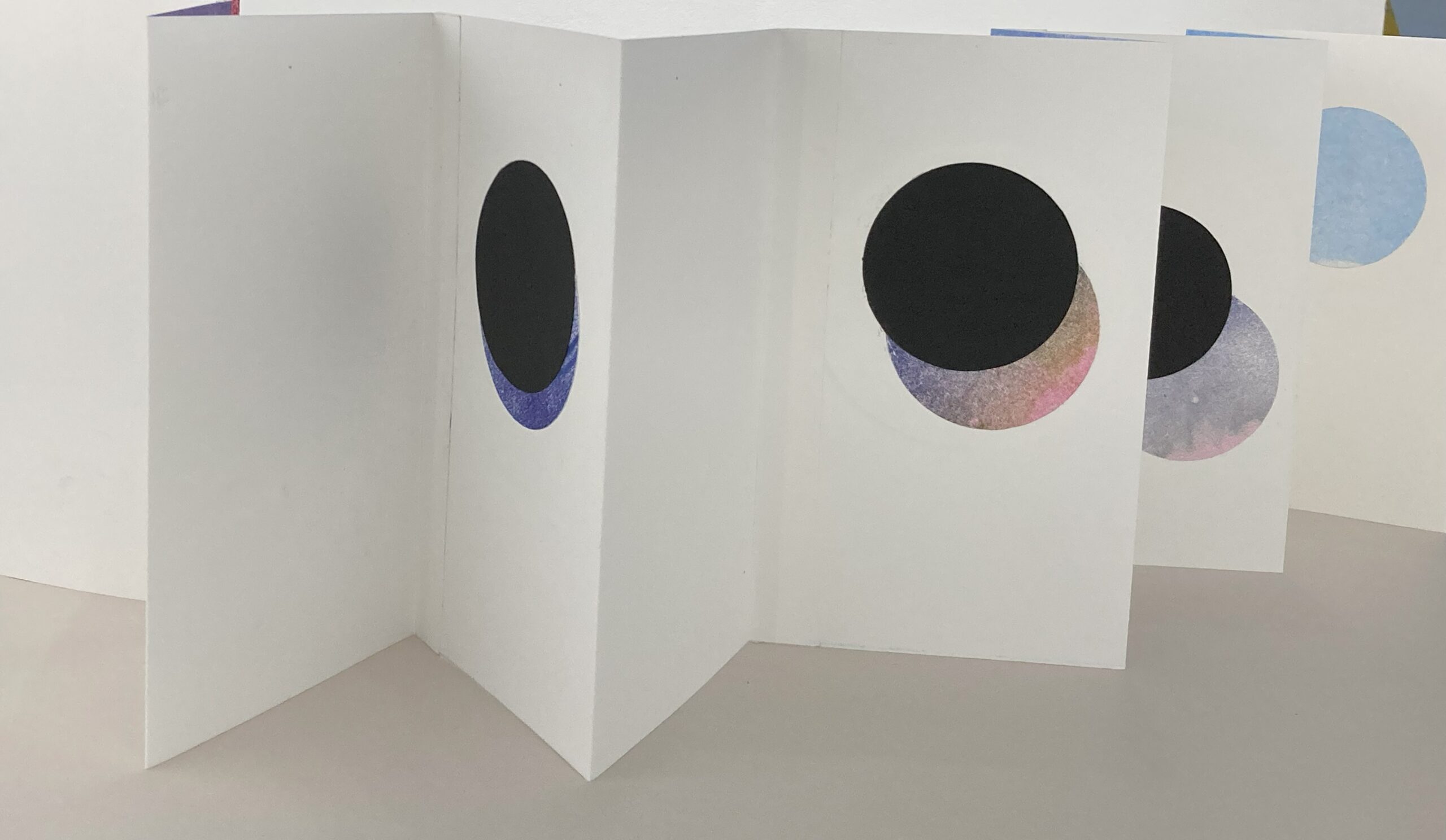
4-8-2024 (2)
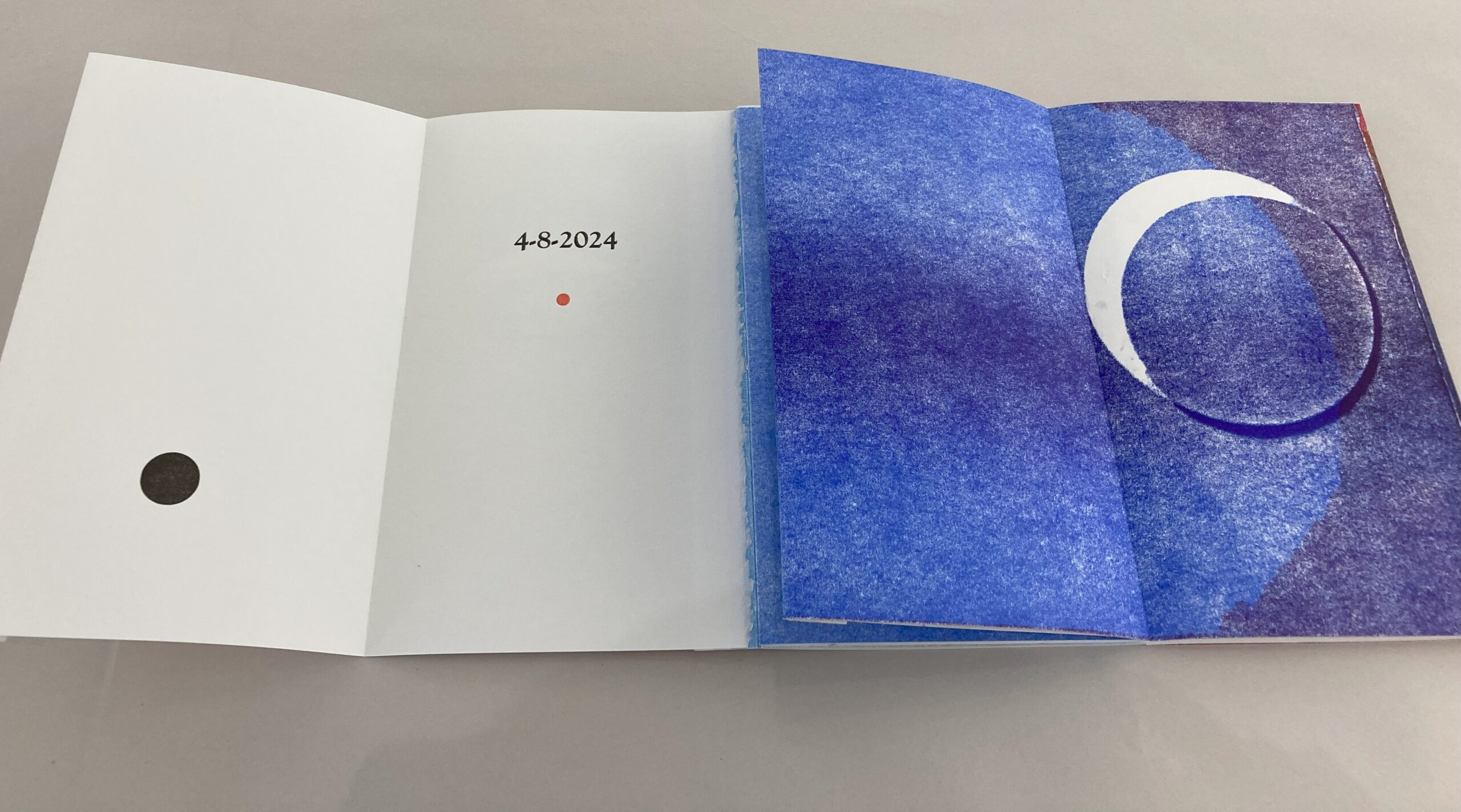
4-8-2024 (3)
Wendy Partridge
Deborah Pinter
Bellamy Printz
Noel Reifel
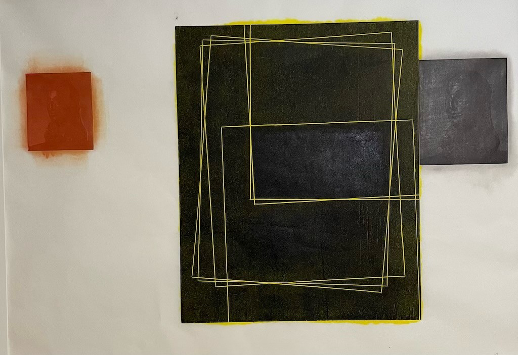
Art History 1
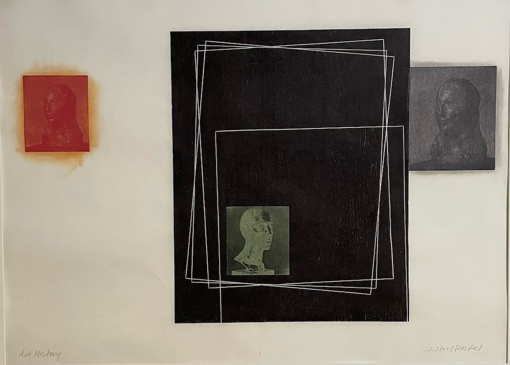
Art History 4
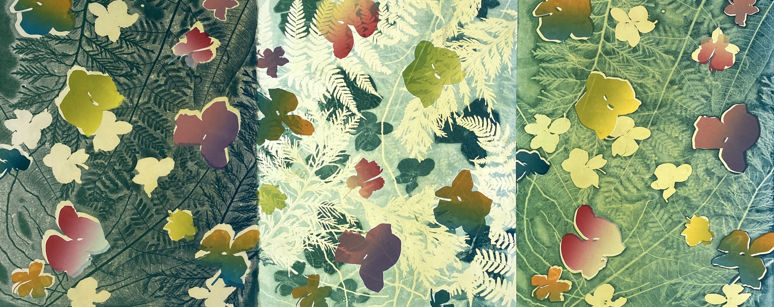
The Earth Laughs in Flowers; 1,2,3
2024, Pressure Prints and Monoprints, 24″ x 63″ (triptych)
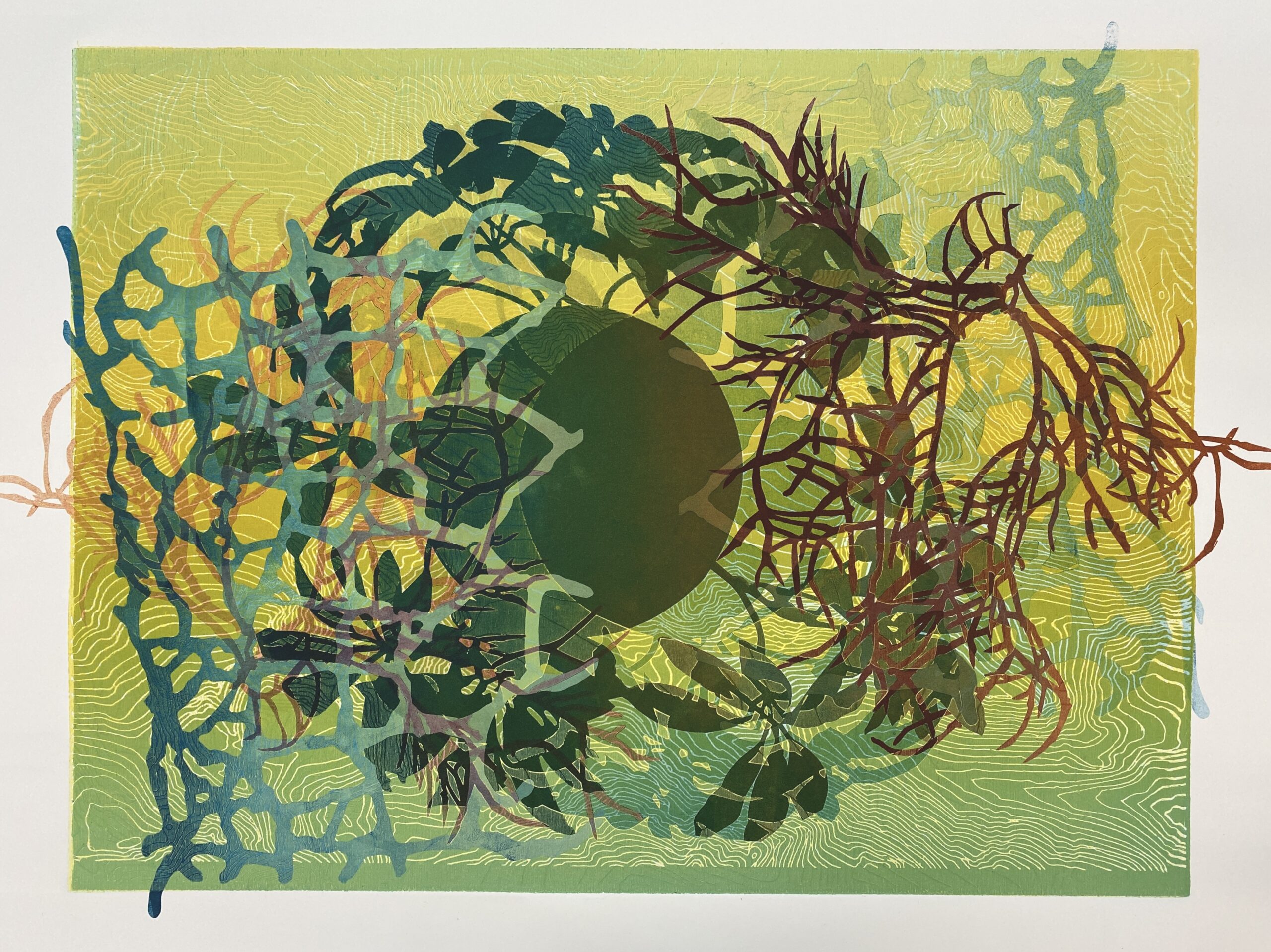
Emergence #3
Global Aberrations #3, Feel the Heat
2023, Relief Monoprint, 26″ x 33″
Lisa Schonberg
Medium for Global Aberrations Series: This print is one of a series of prints combining monoprinting using handcut stencils and relief printing from a laser etched woodblock. Making one-of-a-kind printed works on paper is my preferred way of printing. I usually don’t make a traditional “edition” of prints (a set of identical images). Instead, I like making prints using various different matrices and layering imagery. Each print is different even though there may be similar ones in the creation of a series of related images on one topic. I work experimentally, changing up the techniques and subject matter to suit my ideas and to challenge me.
Read More
Inspiration for Global Aberrations Series: The print exhibited here titled “Global Aberrations #3, Feel the Heat” is from a series of 12 monoprints. This series started out as a response to last summer’s global record-breaking temperatures and ongoing global climate extremes. Utilizing intense color and the repetition of symbolic organic forms (the sphere as earth/sun or moon, foliage shadows, leaf shapes, seaweed texture, ice cracks and topographical linear patterns) my intention is to show reverence for our natural world as well as point out abnormal climate activity, as indicated by some of the titles such as, Feel the Heat, Rising Tides, Cool Heat and Overgrowth. Even though the work may appear pleasing and everything seems like it comes together in a balanced way, underlying these images lies a difficult truth. Hopefully this work can inspire us to think about our current condition of the planet and to collectively find ways towards creating a better, healthier earth.
The Earth Laughs in Flowers; 1,2,3
Medium for “The Earth Laughs in Flowers” Series: In this triptych I am utilizing a technique called pressure printing along with printing handcut stencils and foliage from my garden. The pressure printing technique is similar to doing a crayon rubbing and reveals the nuanced textures and shapes of the chosen real foliage. In addition to this process, I inked and printed plastic stencils in the shapes of flattened orchids and other flowers. In monoprinting only about 70% of the ink is printed on the first print. I use the leftover ink from the first print, added to new ink layers to make variations on the theme as long as the ink remains wet and pliable. These 3 prints all relate to one another revealing a different atmosphere using this continuing process of printing.
Inspiration for the Earth Laughs in Flowers Series: The title “ The Earth Laughs in Flowers” comes from a line in a poem titled “Hamatreya” by Ralph Waldo Emerson published in 1847 and roughly translates to “Hail, Mother Earth”. This poem deals with the complex relationship between humans and nature and how humans have a need to conquer nature and claim it for their own and how futile this notion is. As we have seen through history and as is evidenced by our current climate crisis, this practice can and will backfire. For me this is why mother nature is “laughing in flowers”! Nature can’t be tamed or taken over or taken for granted, she just keeps on adapting and giving despite what we do to her. These series of monoprints (currently there are about 15 of them) are my attempt to create reverence for our planet as we navigate the complexities of how to sustain a healthier natural environment. It is my hope that we adopt the attitude of working with mother nature not against her.
Showing Off, Ghost
Medium for “Showing Off, Ghost”: This print is a monotype, made from painting or rolling ink on a non-porous surface such as in this case, clear acrylic plastic. Monotypes differ from monoprints in that they lack a fixed (etched, cut or scratched) matrix from which ink is applied and then printed. Both types of prints are considered one-of-a-kind images that can never be identically duplicated. Yet in a monoprint, the matrix has some permanent information etched, cut or scratched into the surface, and the artist chooses to make a unique variant of the fixed image on the plate. While on the other hand, a monotype is made on a matrix that is devoid of any permanent information. The image can be painted a second time but each subsequent print will be different. This type of printing is not concerned with making editions or a set of identical prints; each image is unique.
In addition, the artist can utilize the leftover ink on the plate from the first print to make a second print called a cognate or “ghost” without washing off the plate. This kind of 2nd print is generally lighter in tonality and is varied according to how the artist applies the ink for the second print. In both monoprints and monotypes the artist has the freedom to manipulate the ink in inventive ways making it exciting for those that wish to experiment and get different results each time.
Inspiration for Showing Off, Ghost: This print comes from a series of painted monotypes responding to research I did regarding bird behaviors. I was struck with the realization that some bird behaviors are very similar to human interpersonal relationships. This bird configuration is intended to mimic confidence by using an upright stature of the bird that may be trying to impress a mate or “show off”. In the title, the word “Ghost” refers to the way this image was made. It utilizes leftover ink from a previous monotype and is lighter in tonality. A few passes with the brayer over top of the plate before printing again, also called a roll-over, reveals a ghost-like atmosphere.
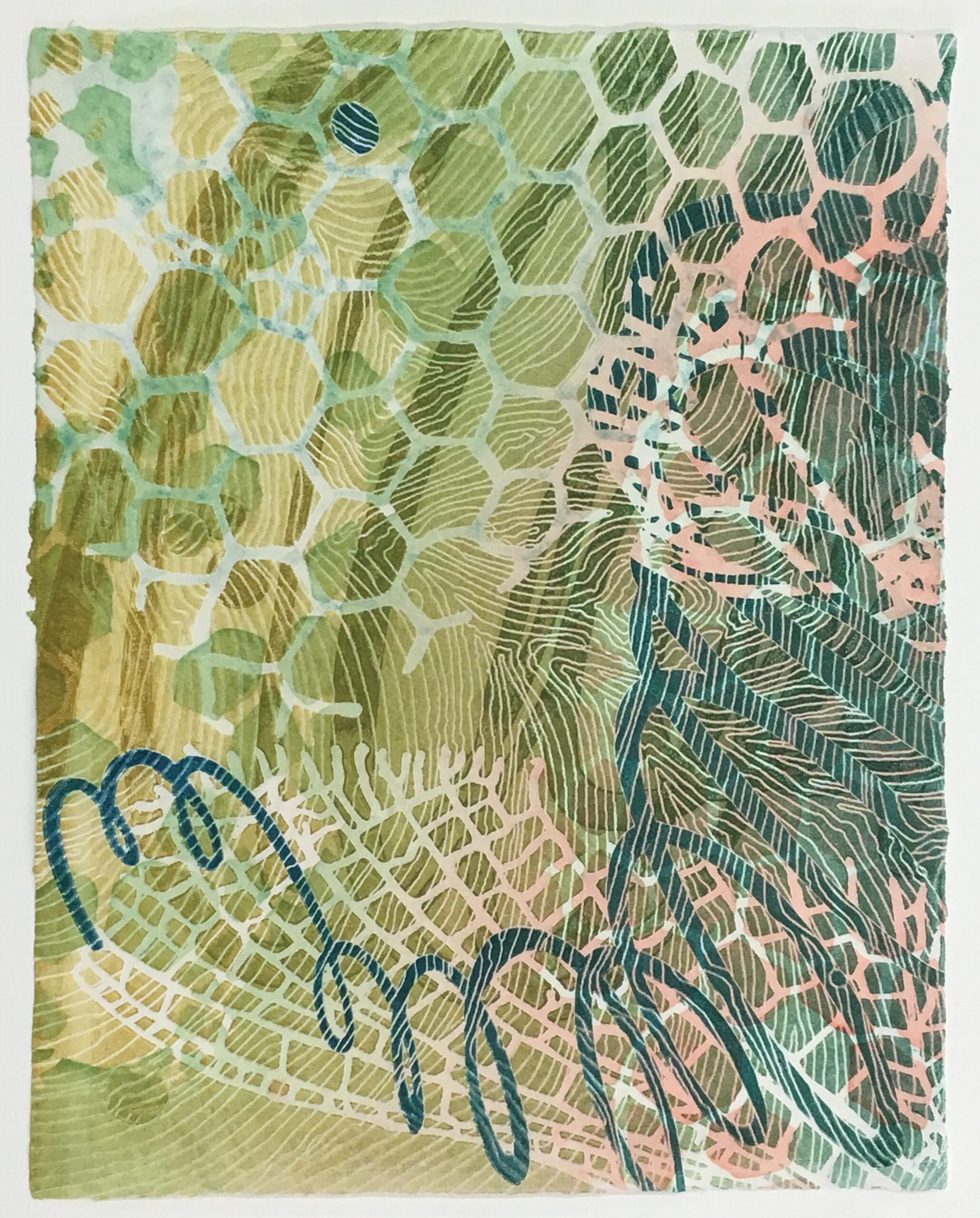
Emergence #2
Medium for “Emergence #2”: This print is a combination of a relief print, a monoprint from an etched plastic plate and handcut stencils and pulp painting which created the paper it is printed on. First the colored pulp was manipulated into an image and dried as a sheet of paper. Then the monoprint was printed on top of the pulp painted paper to reveal the rest of the image of forms from nature.
Inspiration for Emergence #2: Nature’s intricate patterns were the inspiration for this image. I used such items as the hexagonal shapes of the cells of a hornet’s nest, close-up views of mayfly wings and the linear pattern of a wind weather map to form an image that seems to emerge from the surface. This is intended to be a celebration of our natural world and reveal the joy and fascination we can have if we closely observe and revere nature.
Micheal Whitehead
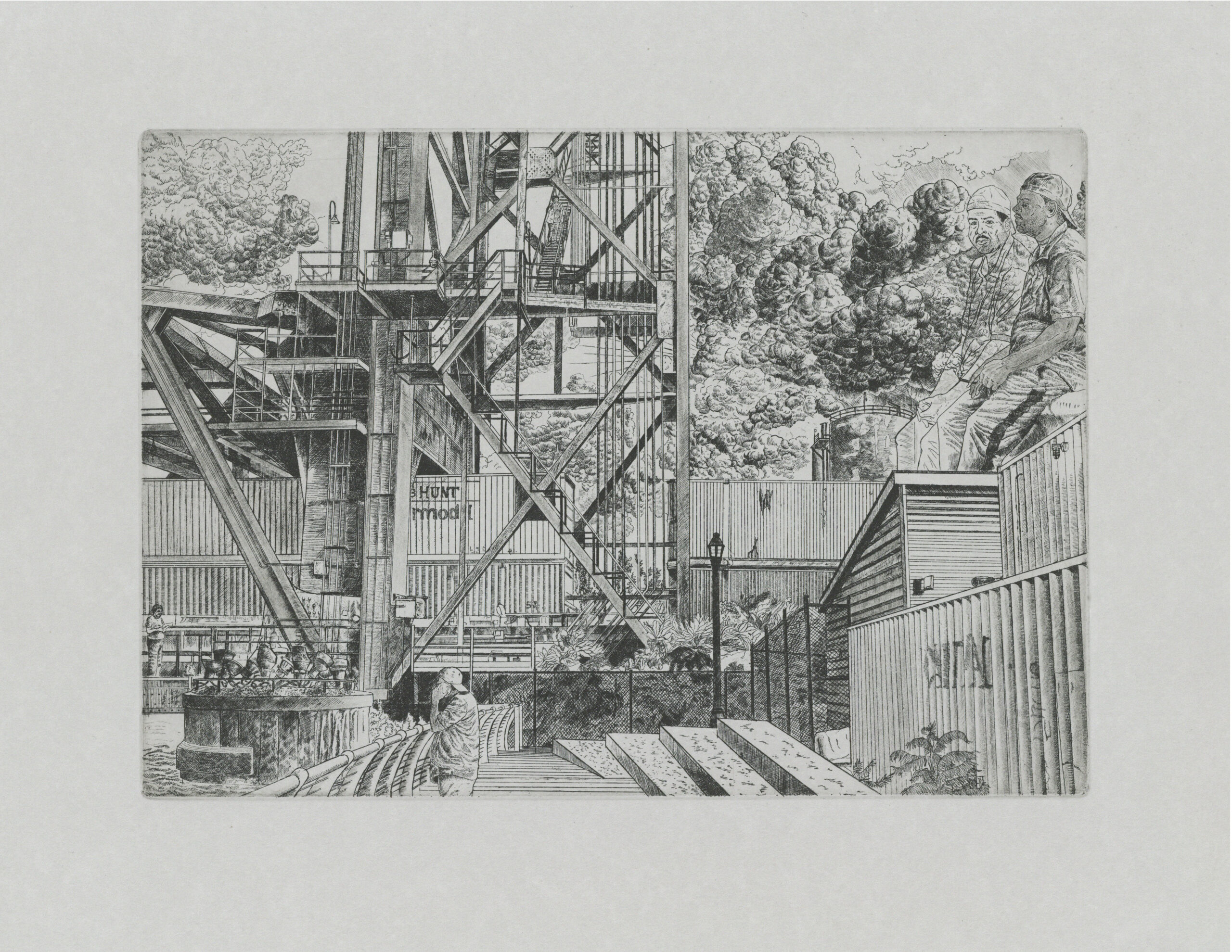
Along The Cuyahoga
Etching, 7″ x 10″ plate size, 11″ x 14″ paper size
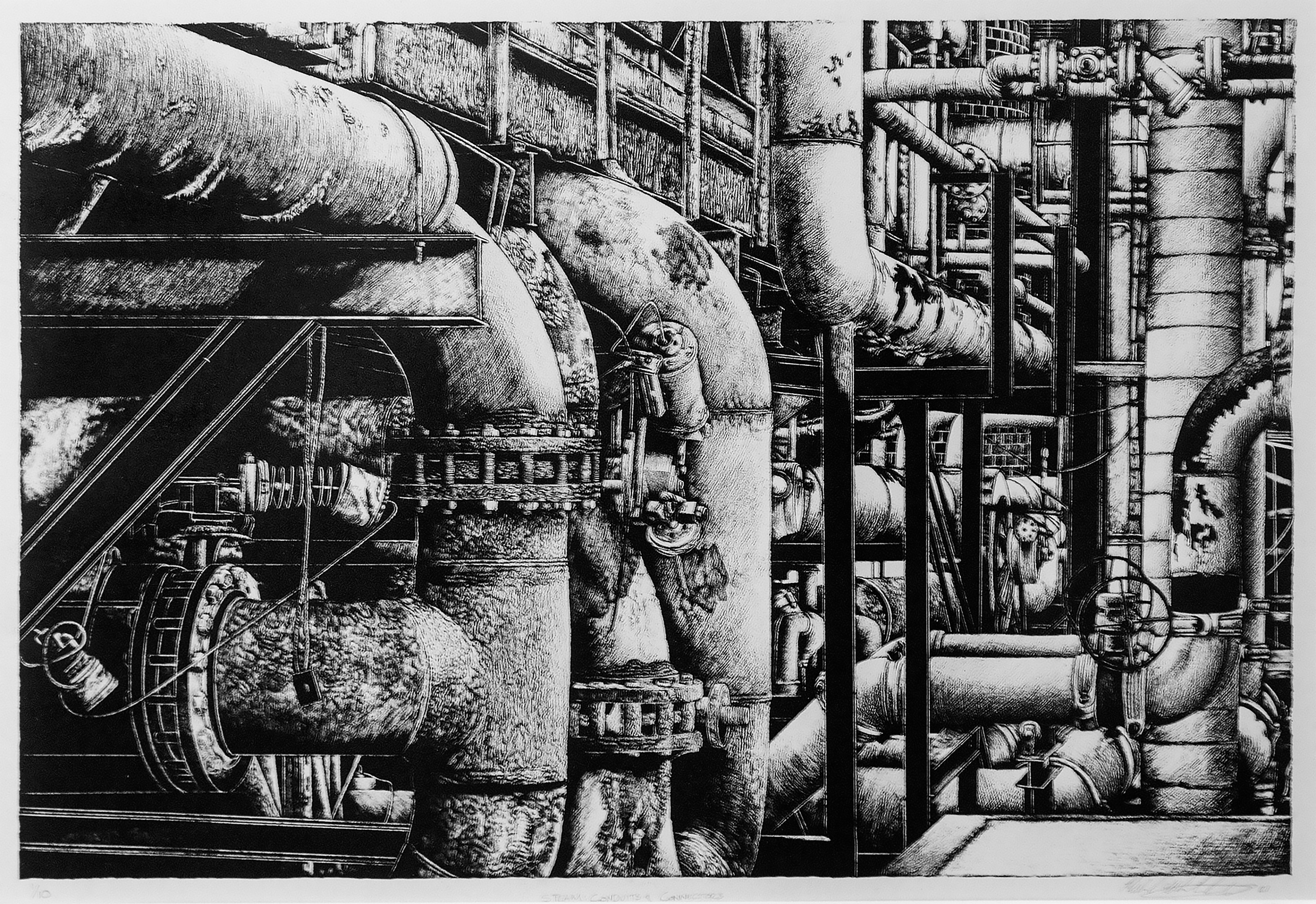
Steam Conduits and Connectors
Lithograph, 14″ x 18″
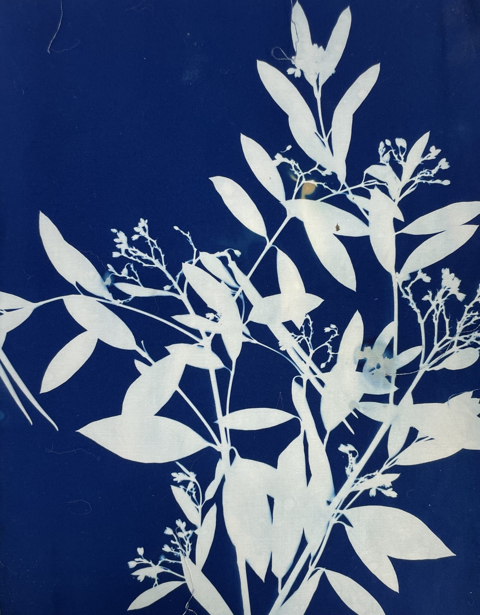
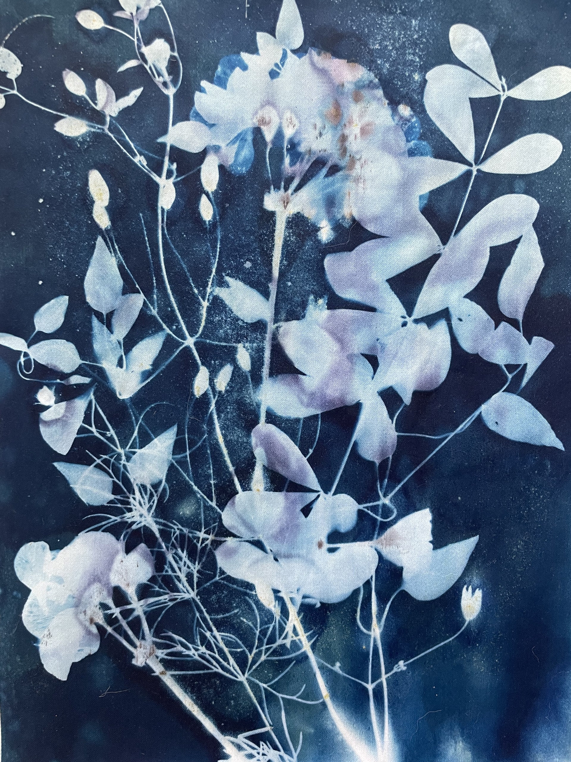
Cyanotype I
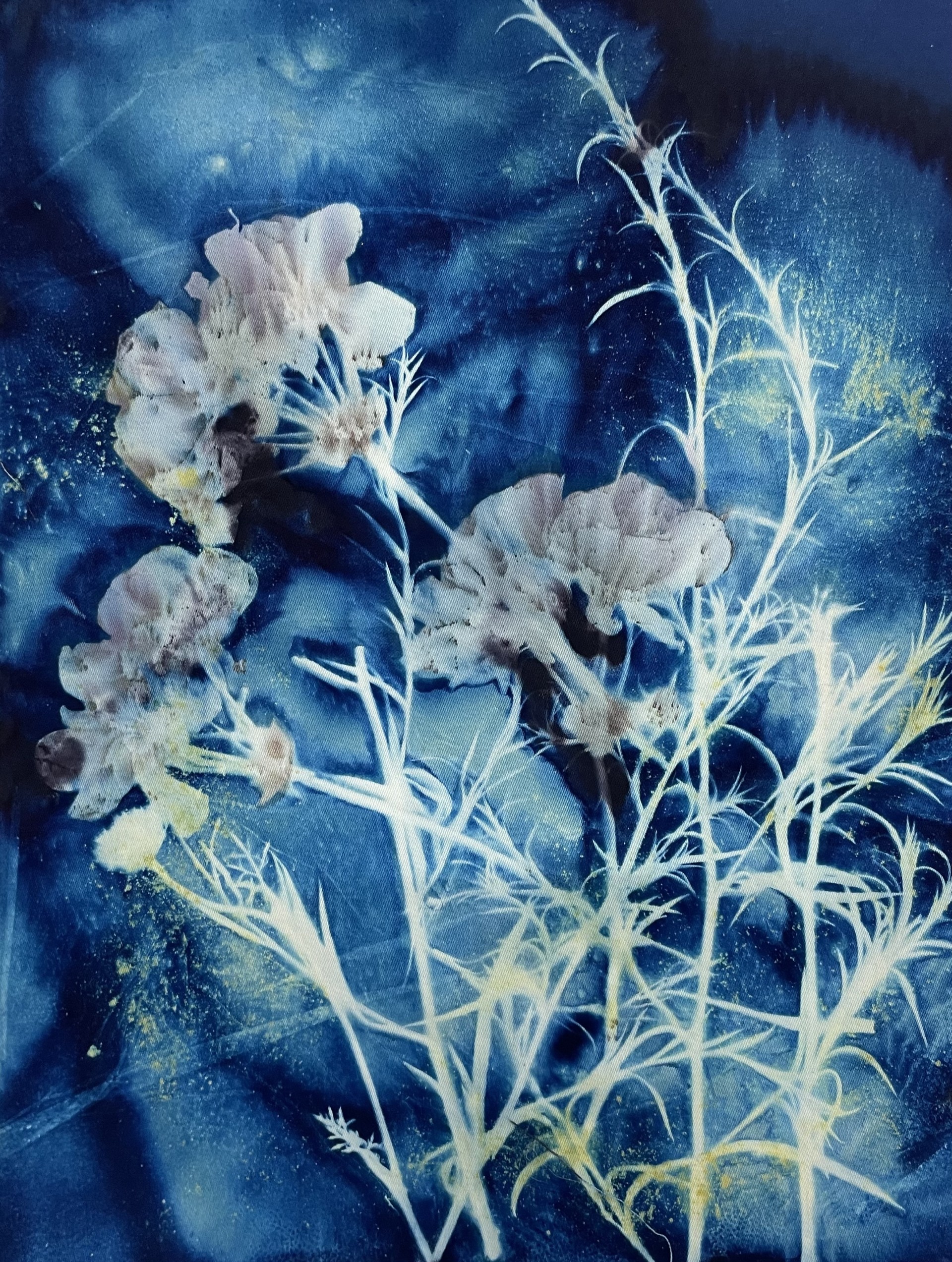
Summer Tradition
A Touch of Violet
Paula Zinsmeister
Jan Zorman
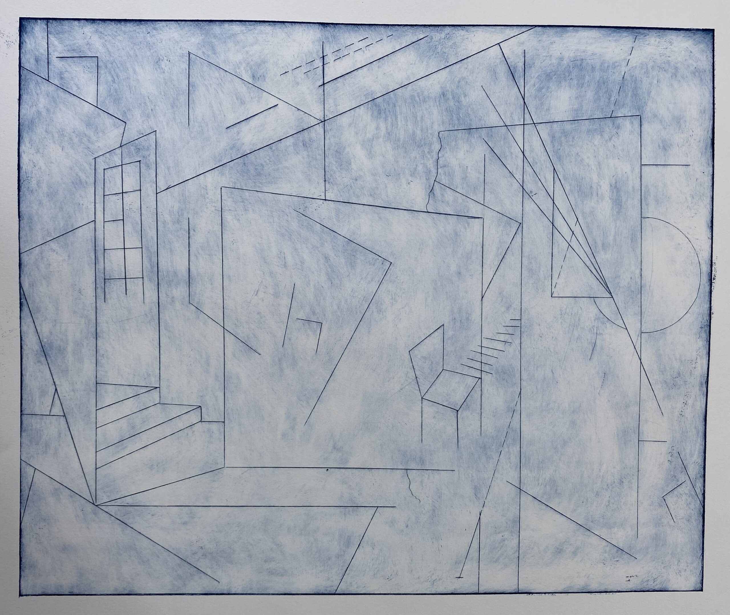
I started my art education as a painter but over time my process evolved to three-dimensional installation work. I worked with yarn and monofilament to create lines and planes in space. To explore two dimensional images on paper I turned to print making. I discovered the community aspect of printmaking at Zygote Press – sharing equipment, knowledge, and encouragement. Printmaking allows for seemingly limitless exploration. I particularly enjoy the process of dry point – drawing an image in reverse, directly on the plate with a scribe. Traditionally this is done on a zinc or copper plate. I discovered that using a plexiglass plate instead is not only more economical but has the advantage of being transparent so that in the drawing and inking process the plate can be turned around to see the final image in process. Again traditionally, when ink is applied to the dry point plate it is wiped with a tarlatan rag to remove all ink except for that in the lines. I’ve been working with a wiping process that leaves a thin layer of ink across the plate to produce plate tone to add another element to the image. I find that each plate becomes a base for adding tone, color, texture or layering to present multiple iterations of the same image.

95 East Bagley Road
Berea, Ohio 44017
(440) 826-2152
artgallery@bw.edu
MONDAY: 2:00pm - 5:00pm
TUESDAY: 2:00pm - 5:00pm
WEDNESDAY: 2:00pm - 5:00pm
THURSDAY: 2:00pm - 5:00pm
FRIDAY: 2:00pm - 5:00pm
SATURDAY: CLOSED
SUNDAY: CLOSED
BY APPOINTMENT (440) 826-2152